 WPF中文网
首先我们介绍一下WPF的依赖属性系统,它是指WPF提供的一组服务,专门用来扩展WPF的属性功能,而受到这些服务支持的属性就称为依赖属性。
WPF的依赖属性系统对于开发者而言,几乎是感知不到的,它通过DependencyProperty类型的一些静态方法成员,提供一系列注册依赖属性或附加属性的功能,让我们可以向依赖属性系统注册属于我们自己写的依赖属性。
为了对比CLR普通属性与WPF的依赖属性的区别,直观的认知两者的概念,我们先来看看普通属性的定义
一、普通属性的定义
private int length = 0;
public int Length
{
    get { return length; }
    set { length = value; }
}
CLR普通属性的本质是在内部定义了一个私有字段,然后通过属性包装器将内部私有定段公开出来,get表示读出私有字段的值,set表示写入值到私有字段。假如WPF控件上的某个属性就是这类的普通属性,那么我们要更新这个属性的值,就只能赋值,用不能采用WPF的绑定方式了,因为只有依赖属性才支持绑定。
二、依赖属性的定义
在C#后端的类型中,输入:propdp,然后按下tab键,VS会自动帮我们输入以下代码:
public int MyProperty
{
    get { return (int)GetValue(MyPropertyProperty); }
    set { SetValue(MyPropertyProperty, value); }
}

// Using a DependencyProperty as the backing store for MyProperty.
// This enables animation, styling, binding, etc...
public static readonly DependencyProperty MyPropertyProperty =
    DependencyProperty.Register("MyProperty", typeof(int), typeof(ownerclass), new PropertyMetadata(0));
我们来一一分析一下上述代码。
首先是MyPropertyProperty成员,它被声明为DependencyProperty 类型,且用DependencyProperty的Register方法注册,而在注册的时候,传入了4个参数。
第一个参数“MyProperty”:这个MyProperty其实是一个类似普通属性包装器的名字。经过依赖属性系统注册后,将来MyProperty就代表了MyPropertyProperty依赖属性。
第二个参数typeof(int):表示这个MyPropertyProperty的数据类型,也就是我们在使用MyProperty时的数据类型,这里被声明成int型。注意这里要求传入数据类型的反射。
第三个参数typeof(ownerclass):表示当前这个MyPropertyProperty依赖属性是属于哪个类的,一般填写当前这个类型。
第四个参数new PropertyMetadata(0):表示传入一个PropertyMetadata属性元数据。这个PropertyMetadata定义了MyPropertyProperty依赖属性的默认值和回调函数。回调函数就是当属性值发生改变时要执行的逻辑代码。
其次是MyProperty成员,它由CLR属性包装器实现get和set,并且使用了GetValue 和 SetValue成员去读出和写入MyPropertyProperty依赖属性。
咦?哪儿来的GetValue和SetValue?
在讲解WPF的基类时,我们曾经分享过DependencyObject类。这个类就定义了GetValue和SetValue,分别表示获取某个依赖属性的值和写入一个值到某个依赖属性。结论,我们要在某个类中自定义一个依赖属性,那么这个类一定要继承DependencyObject基类。
在了解依赖属性的概念和定义之后,我们就可以正式地去定义并使用它。下一节,我们将以一个实例来说明WPF的依赖属性用法。
——重庆教主 2023年10月25日
通常,我们会在自定义类型中去定义一个依赖属性,比如UserControl用户控件。
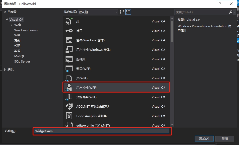
第一步,创建一个新的用户控件,取名为Widget。
第二步,我们在Widget的前端代码中进行控件布局。
<UserControl x:Class="HelloWorld.Controls.Widget"
             xmlns="http://schemas.microsoft.com/winfx/2006/xaml/presentation"
             xmlns:x="http://schemas.microsoft.com/winfx/2006/xaml"
             xmlns:mc="http://schemas.openxmlformats.org/markup-compatibility/2006"
             xmlns:d="http://schemas.microsoft.com/expression/blend/2008"
             xmlns:local="clr-namespace:HelloWorld.Controls"
             mc:Ignorable="d"
             x:Name="userControl"
             FontSize="30"
             Foreground="#666666"
             BorderBrush="#8CDDCD"
             d:DesignHeight="450"
             d:DesignWidth="800">
    <Border BorderBrush="{Binding ElementName=userControl,Path=BorderBrush}">
        <Border.Style>
            <Style TargetType="Border">
                <Setter Property="Padding" Value="10"/>
                <Setter Property="Background" Value="White"/>
                <Setter Property="BorderBrush" Value="#8CDDCD"/>
                <Setter Property="BorderThickness" Value="0 3 0 0"/>
                <Setter Property="Margin" Value="5"/>
                <Style.Triggers>
                    <Trigger Property="IsMouseOver" Value="True">
                        <Setter Property="Background" Value="#F7F9F9"/>
                    </Trigger>
                </Style.Triggers>
            </Style>
        </Border.Style>
        <Grid>
            <Grid.ColumnDefinitions>
                <ColumnDefinition/>
                <ColumnDefinition Width="auto"/>
            </Grid.ColumnDefinitions>
            <Grid.RowDefinitions>
                <RowDefinition/>
                <RowDefinition/>
            </Grid.RowDefinitions>
            <TextBlock Grid.Row="0" Grid.Column="0" Text="{Binding Value}"
                       Foreground="{Binding ElementName=userControl,Path=Foreground}"
                       FontSize="{Binding ElementName=userControl,Path=FontSize}" />
            <TextBlock Grid.Row="1" Grid.Column="0" Text="{Binding Title}"
                       Foreground="{Binding ElementName=userControl,Path=Foreground}"
                       FontSize="14" TextWrapping="Wrap"/>
            <TextBlock Grid.Row="0" Grid.Column="1" Text="{Binding Icon}"
                       Foreground="{Binding ElementName=userControl,Path=BorderBrush}"
                       FontSize="26" Grid.RowSpan="2" VerticalAlignment="Center"/>
        </Grid>
    </Border>
</UserControl>
在这里,我们一共实例化了5个控件,最外层的Border控件用来做修饰,且它的边框颜色绑定了当前UserControl控件的边框颜色。Grid里面有3个TextBlock文字块控件,其中的前景色、字号也分别绑定了当前UserControl的属性。这样做的好处是,将来实例化这个Widget自定义用户控件时,我们就可以设置它的相关属性,从而改变内部的边框颜色、字体颜色和字体大小。
需要注意的是,3个TextBlock控件Text属性分别绑定了Value、Title、Icon三个属性,这三个属性就是我们要去自定义的依赖属性。
第三步,定义依赖属性。
using System;
using System.Collections.Generic;
using System.Linq;
using System.Text;
using System.Threading.Tasks;
using System.Windows;
using System.Windows.Controls;
using System.Windows.Data;
using System.Windows.Documents;
using System.Windows.Input;
using System.Windows.Media;
using System.Windows.Media.Imaging;
using System.Windows.Navigation;
using System.Windows.Shapes;

namespace HelloWorld.Controls
{
    /// <summary>
    /// Widget.xaml 的交互逻辑
    /// </summary>
    public partial class Widget : UserControl
    {
        public Widget()
        {
            InitializeComponent();

            DataContext = this;
        }


        public string Icon
        {
            get { return (string)GetValue(IconProperty); }
            set { SetValue(IconProperty, value); }
        }

        public static readonly DependencyProperty IconProperty =
            DependencyProperty.Register("Icon", typeof(string), typeof(Widget), new PropertyMetadata("☻"));


        public string Title
        {
            get { return (string)GetValue(TitleProperty); }
            set { SetValue(TitleProperty, value); }
        }

        public static readonly DependencyProperty TitleProperty =
            DependencyProperty.Register("Title", typeof(string), typeof(Widget), new PropertyMetadata("请输入标题"));


        public string Value
        {
            get { return (string)GetValue(ValueProperty); }
            set { SetValue(ValueProperty, value); }
        }

        public static readonly DependencyProperty ValueProperty =
            DependencyProperty.Register("Value", typeof(string), typeof(Widget), new PropertyMetadata("内容"));
    }
}
通过在C#后端输入propdp,再按下tab键,VS会自动创建依赖属性的定义模板代码,我们只需要修改模板中的属性类型、属性名、和注册依赖属性时的相关参数即可。如上述代码所示,这里分别注册了IconProperty、TitleProperty和ValueProperty三个依赖属性,并且将它们注册到Widget类型上。由于依赖属性天生具有属性通知功能,所以我们不必去实现INotifyPropertyChanged接口,只需要将当前类做为ViewModel传给Widget的DataContent,前端的控件就可以绑定Value、Title、Icon三个属性了。
第四步,使用自定义控件
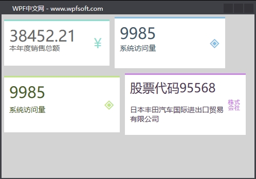
我们回到MainWindow.xaml代码中,并实例化4个Widget自定义控件。
<Window x:Class="HelloWorld.MainWindow"
        xmlns="http://schemas.microsoft.com/winfx/2006/xaml/presentation"
        xmlns:x="http://schemas.microsoft.com/winfx/2006/xaml"
        xmlns:d="http://schemas.microsoft.com/expression/blend/2008"
        xmlns:mc="http://schemas.openxmlformats.org/markup-compatibility/2006"
        xmlns:local="clr-namespace:HelloWorld" xmlns:controls="clr-namespace:HelloWorld.Controls"
        mc:Ignorable="d" Background="LightGray"
        Title="WPF中文网 - www.wpfsoft.com" Height="350" Width="500">
    <StackPanel>
        <StackPanel Orientation="Horizontal">
            <controls:Widget Icon="¥"
                             Title="本年度销售总额"
                             Value="38452.21"
                             Width="215"
                             Height="100"/>
            <controls:Widget Icon="◈"
                             Title="系统访问量"
                             Value="9985"
                             Foreground="#415767"
                             BorderBrush="#87BEE4"
                             Width="225"
                             Height="110"/>
        </StackPanel>
        <StackPanel Orientation="Horizontal">
            <controls:Widget Icon="◈"
                             Title="系统访问量"
                             Value="9985"
                             Foreground="#495E26"
                             BorderBrush="#C1E487"
                             Width="235"
                             Height="120"/>
            <controls:Widget Icon="㍿"
                             Title="日本丰田汽车国际进出口贸易有限公司"
                             Value="股票代码95568"
                             Foreground="#4E3A55"
                             BorderBrush="#CB87E4"
                             FontSize="24"
                             Width="245"
                             Height="130"/>
        </StackPanel>
    </StackPanel>

</Window>
在实例化Widget自定义控件后,设置依赖属性不同的值,控件就会绘制不同的呈现效果。
而且,Widget中的Value、Title、Icon三个属性还支持绑定功能,在本例中是直接赋值。关于依赖属性的初步了解,我们就先介绍到这里,下一讲,我们将更深入一些,去了解关于依赖属性的回调函数的用法。
当前课程源码下载:(注明:本站所有源代码请按标题搜索)
文件名:083-《DependencyProperty定义与使用》-源代码.rar
链接:https://pan.baidu.com/s/1yu-q4tUtl0poLVgmcMfgBA
提取码:wpff
——重庆教主 2023年10月26日
PropertyChangedCallback是一个委托,表示在依赖属性的有效属性值更改时调用的回调。也就是说,当我们修改了某个依赖属性的值后,还希望立即做一些事情,那就在注册(定义)一个依赖属性时,将一个方法名通过PropertyMetadata构造函数注入,一并注册到依赖属性系统当中。
一、什么是PropertyMetadata?
我们在定义一个依赖属性时,希望指明这个依赖属性的默认值,或者指明它的回调函数,这些信息都可以放到PropertyMetadata类中。
public class PropertyMetadata
{
public PropertyMetadata();
public PropertyMetadata(object defaultValue);
public PropertyMetadata(PropertyChangedCallback propertyChangedCallback);
public PropertyMetadata(object defaultValue, PropertyChangedCallback propertyChangedCallback);
public PropertyMetadata(object defaultValue, PropertyChangedCallback propertyChangedCallback, CoerceValueCallback coerceValueCallback);

public object DefaultValue { get; set; }
public PropertyChangedCallback PropertyChangedCallback { get; set; }
public CoerceValueCallback CoerceValueCallback { get; set; }
protected bool IsSealed { get; }

protected virtual void Merge(PropertyMetadata baseMetadata, DependencyProperty dp);
protected virtual void OnApply(DependencyProperty dp, Type targetType);
}
DefaultValue 属性:表示依赖属性的默认值。
PropertyChangedCallback 属性:一个回调委托对象。当依赖属性值发现改变时触发执行。
CoerceValueCallback 属性:一个回调委托对象。表示强制转换时执行的业务逻辑,它会先于PropertyChangedCallback 委托触发。
举例说明:
/// <summary>
/// 格子数量
/// </summary>
public int Count
{
    get { return (int)GetValue(CountProperty); }
    set { SetValue(CountProperty, value); }
}

public static readonly DependencyProperty CountProperty =
    DependencyProperty.Register("Count", typeof(int), typeof(TrayControl),
        new PropertyMetadata(
            0,
            new PropertyChangedCallback(OnCountPropertyChangedCallback),
            new CoerceValueCallback(OnCountCoerceValueCallback)));
在上面的代码中,我们实例化了一个PropertyMetadata对象,并传入了3个参数,分别是0、PropertyChangedCallback和CoerceValueCallback。其中第一个参数0表示Count属性的默认值,当外界改变Count 值时,首先会触发OnCountCoerceValueCallback回调函数的执行,然后是OnCountPropertyChangedCallback回调函数的执行。
二、如何使用依赖属性的回调函数
接下来我们来举例说明依赖属性的定义、回调函数的定义和使用。
假定我们拥有一个自动分捡机器人,它会根据我们提前定义好的托盘格子以及每个格子的状态,自动去执行分捡动作。我们在定义托盘时,可以为每个格子定义一个X坐标和Y坐标,届时由伺服电机驱动机器人手臂去实现分捡。
我们在本例中只实现托盘的初始化,以及每个格子的尺寸初始化,状态的变化。这会用到自定义控件,并利用依赖属性以及回调函数去实现相关的业务逻辑。
第一步,定义格式的样式,我们在App.xaml的资料中定义一个Style。
<Style x:Key="CheckBoxDishStyle" TargetType="CheckBox">
    <Setter Property="Width" Value="60"/>
    <Setter Property="Height" Value="60"/>
    <Setter Property="Background" Value="White"/>
    <Setter Property="Margin" Value="2"/>
    <Setter Property="Template">
        <Setter.Value>
            <ControlTemplate TargetType="CheckBox">
                <Border Width="{TemplateBinding Width}"
                                Height="{TemplateBinding Height}"
                                CornerRadius="{Binding RelativeSource={RelativeSource Mode=Self},Path=Width}"
                                Background="{TemplateBinding Background}"
                                BorderBrush="#BCB33C"
                                BorderThickness="2" >
                    <TextBlock Text="{TemplateBinding Name}"
                               HorizontalAlignment="Center"
                               VerticalAlignment="Center"/>
                </Border>
            </ControlTemplate>
        </Setter.Value>
    </Setter>
    <Style.Triggers>
        <Trigger Property="IsChecked" Value="True">
            <Setter Property="Background" Value="#F38B76"/>
        </Trigger>
        <Trigger Property="IsMouseOver" Value="True">
            <Setter Property="Background" Value="#F38B76"/>
        </Trigger>
    </Style.Triggers>
</Style>
第二步,创建一个用户控件,取名为TrayControl。并在XAML中定义一个container容器, 用于显示初始化的格式。
<ScrollViewer>
    <WrapPanel x:Name="container"/>
</ScrollViewer>
第三步,在TrayControl的C#后台语言中,定义如下几个依赖属性。
/// <summary>
/// 托盘
/// </summary>
public partial class TrayControl : UserControl
{
    public TrayControl()
    {
        InitializeComponent();
    }


    /// <summary>
    /// 格子大小
    /// </summary>
    public int Size
    {
        get { return (int)GetValue(SizeProperty); }
        set { SetValue(SizeProperty, value); }
    }

    public static readonly DependencyProperty SizeProperty =
        DependencyProperty.Register("Size", typeof(int), typeof(TrayControl),
            new PropertyMetadata(60,new PropertyChangedCallback(OnSizePropertyChangedCallback)));

    private static void OnSizePropertyChangedCallback(DependencyObject d, DependencyPropertyChangedEventArgs e)
    {
        TrayControl control = d as TrayControl;
        control.Initlize();
    }


    /// <summary>
    /// 格子数量
    /// </summary>
    public int Count
    {
        get { return (int)GetValue(CountProperty); }
        set { SetValue(CountProperty, value); }
    }

    public static readonly DependencyProperty CountProperty =
        DependencyProperty.Register("Count", typeof(int), typeof(TrayControl),
            new PropertyMetadata(
                0,
                new PropertyChangedCallback(OnCountPropertyChangedCallback),
                new CoerceValueCallback(OnCountCoerceValueCallback)));

    //这里演示当依赖属性值等于10,强制与10相乘,输出100
    private static object OnCountCoerceValueCallback(DependencyObject d, object baseValue)
    {
        int count = (int)baseValue;
        if (count == 10)
        {
            return count * 10;

        }
        return baseValue;
    }

    private static void OnCountPropertyChangedCallback(DependencyObject d, DependencyPropertyChangedEventArgs e)
    {
        TrayControl control = d as TrayControl;
        control.Initlize();

    }

    private void Initlize()
    {
        SelectedCount = 0;
        container.Children.Clear();
        SelectedItems.Clear();

        if (Count > 0)
        {
            for (int i = 0; i < Count; i++)
            {
                CheckBox checkBox = new CheckBox();
                checkBox.Style = Application.Current.Resources["CheckBoxDishStyle"] as Style;
                checkBox.Width = Size;
                checkBox.Height = Size;
                checkBox.Tag = new Point(i * 10, Size + i * 2);
                checkBox.Name = "_"+i.ToString();
                checkBox.Checked += (sender, args) =>
                {
                    SelectedCount++;
                    SelectedItems.Add(checkBox);
                };
                checkBox.Unchecked += (sender, args) =>
                {
                    SelectedCount--;
                    SelectedItems.Remove(checkBox);

                };
                container.Children.Add(checkBox);
            }
        }
    }


    public int SelectedCount
    {
        get { return (int)GetValue(SelectedCountProperty); }
        set { SetValue(SelectedCountProperty, value); }
    }

    public static readonly DependencyProperty SelectedCountProperty =
        DependencyProperty.Register("SelectedCount", typeof(int), typeof(TrayControl),
            new PropertyMetadata(0));


    public List<CheckBox> SelectedItems
    {
        get { return (List<CheckBox>)GetValue(SelectedItemsProperty); }
        set { SetValue(SelectedItemsProperty, value); }
    }

    public static readonly DependencyProperty SelectedItemsProperty =
        DependencyProperty.Register("SelectedItems", typeof(List<CheckBox>), typeof(TrayControl),
            new PropertyMetadata(new List<CheckBox>()));


}
在上面的代码中,我们定义了Count属性表示格式的数量,Size属性表示格式的尺寸,SelectedCount属性表示非空格子的数量,SelectedItems属性表示非空格式的集合。
在Count属性和Size属性发生改变时,会去执行各自的回调函数,在回调函数中调用了Initlize方法成员,该 方法成员的功能是根据Count数量和Size尺寸实例化一些CheckBox(表示格子)对象,同时生成了一些演示坐标放到CheckBox的Tag属性中,方便将来的驱动器使用,最后将其放到container容器中显示出来。
关于CheckBox,我们在它的Style样式中,利用IsChecked属性呈现两种效果,即空白状态和填充状态。
待这个用户控件做好了,我们就可以在主窗体中使用它了。
第四步,使用控件
<Window x:Class="HelloWorld.MainWindow"
        xmlns="http://schemas.microsoft.com/winfx/2006/xaml/presentation"
        xmlns:x="http://schemas.microsoft.com/winfx/2006/xaml"
        xmlns:d="http://schemas.microsoft.com/expression/blend/2008"
        xmlns:mc="http://schemas.openxmlformats.org/markup-compatibility/2006"
        xmlns:local="clr-namespace:HelloWorld" xmlns:controls="clr-namespace:HelloWorld.Controls"
        mc:Ignorable="d" Background="LightGray"
        Title="WPF中文网 - www.wpfsoft.com" Height="350" Width="500">
    <Grid>
        <Grid.RowDefinitions>
            <RowDefinition/>
            <RowDefinition Height="45"/>
        </Grid.RowDefinitions>
        <controls:TrayControl x:Name="tray"
                              Margin="5" Background="White"
                              Size="{Binding ElementName=sliderSize,Path=Value}"
                              Count="{Binding ElementName=sliderCount,Path=Value}"/>
        <StackPanel Grid.Row="1" Orientation="Horizontal">
            <StackPanel >
                <StackPanel Orientation="Horizontal">
                    <TextBlock Text="托盘尺寸" Margin="3" VerticalAlignment="Center"/>
                    <Slider x:Name="sliderSize"  Width="200" Value="30"
                            Maximum="100" VerticalAlignment="Center"/>
                </StackPanel>
                <Rectangle Height="5"/>
                <StackPanel Orientation="Horizontal">
                    <TextBlock Text="托盘数量" Margin="3" VerticalAlignment="Center"/>
                    <Slider x:Name="sliderCount"  Width="200" Value="0"
                            Maximum="28" VerticalAlignment="Center"/>
                </StackPanel>
            </StackPanel>
            <TextBlock Text="当前装配数量:" Margin="3" VerticalAlignment="Center">
                <Run Text="{Binding ElementName=tray,Path=SelectedCount}"/>
                <Run Text="总数量:"/>
                <Run Text="{Binding ElementName=tray,Path=Count}"/>
            </TextBlock>
            <Button Content="提交" Width="50" Height="25" Click="Button_Click"/>
        </StackPanel>

    </Grid>

</Window>
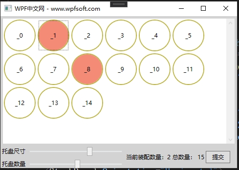
在主窗体中,我们实例化了TrayControl自定义控件,同时,将它的Count和Size分别绑定到Slider滑动务的Value上,方便我们初始化托盘。然后将它的SelectedCount绑定到TextBlock控件显示,最后在提交按钮中,获取当前非空格子的坐标,这样就可以将这些坐标交给运动设备,以此实现硬件的相关功能。
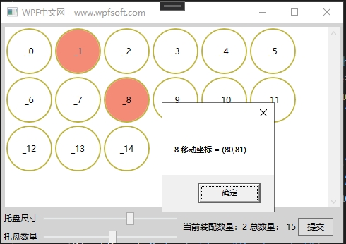
最后,在提交按钮中,我们只需要获取TrayControl的SelectedItems属性,便可以获取所有非空格子的运动坐标了。
public partial class MainWindow : Window
{
    public MainWindow()
    {
        InitializeComponent();


    }

    private void Button_Click(object sender, RoutedEventArgs e)
    {
        foreach (var item in tray.SelectedItems)
        {
            MessageBox.Show($"{item.Name.ToString()} 移动坐标 = ({item.Tag.ToString()})");
        }
    }
}
总结:在这个示例中,由于在TrayControl自定义控件中的前端UI控件并不需要绑定后台的依赖属性,所以,我们并没有将当前类型交给当前类型的DataContext属性中,但是TrayControl被实例化后,它所定义的4个依赖属性于主窗体中的其它控件是可以建立绑定关系的,因为它们都是依赖属性。
当前课程源码下载:(注明:本站所有源代码请按标题搜索)
文件名:084-《PropertyChangedCallback》-源代码.rar
链接:https://pan.baidu.com/s/1yu-q4tUtl0poLVgmcMfgBA
提取码:wpff
——重庆教主 2023年10月26日
一、附加属性的概念
要阐述附加属性这个概念,我们先简单聊一下属性的概念。属性就像一个标签,比如一个人,他的年龄、姓名、性别,这些都叫属性,且终生相随,不会因为时间或空间不同而不同。但是有些属性则不然,比如我们在学校的时候,填写表格会多一栏班级与年级属性,毕业了就没有这两个属性了,去电影院的时候会有一个座位号的属性,只有结婚了才多一个老婆属性,我们不可能在大街上对迎面走来的5岁小男孩说你老婆是谁?所以,出生就自带的属性我们可称为一般属性,而在特定条件下、特定场合下才有的属性,我们可看成是附加属性。
为什么特定场合下的属性叫附加属性呢?本质上讲,班级与年级是学校才有的概念,是学校主动附加到每一个学生身上的,为了方便管理嘛。去电影院也是如此,如果不给每一个客人一个座位,那大家都抢着坐C位,很可能会发生一些比银幕上还精彩的事情。
在WPF中,我们在学习布局控件时,其实也已经使用过附加属性了。下面我们来看一些例子。
<Grid>
    <Grid.RowDefinitions>
        <RowDefinition/>
        <RowDefinition/>
    </Grid.RowDefinitions>
    <Button Grid.Row="0" Content="按钮1"/>
    <Button Grid.Row="1" Content="按钮1"/>
</Grid>
上面的代码中,按钮1被放到Grid的第一行中,按钮2被放到Grid的第二行中。通过Grid.Row附加属性完成这一设置。实际上这个Row属性并没有定义在Button中,而是定义在Grid中,且被定义成附加属性。
<Canvas>
    <Button Canvas.Left="20" Canvas.Top="20" Content="按钮1"/>
    <Button Canvas.Left="80" Canvas.Top="20" Content="按钮1"/>
</Canvas>
观察上面Canvas中的两个按钮,这次为了让它们两个显示在Canvas合适的位置,我们使用了Canvas.Left和Canvas.Top两个属性,分别去设置按钮相对于Canvas的左边距和顶边距。此时,在Canvas类中就定义了Left和Top两个附加属性。
<DockPanel LastChildFill="False">
    <Button DockPanel.Dock="Left" Content="按钮1"/>
    <Button DockPanel.Dock="Right" Content="按钮1"/>
</DockPanel>
观察上面的DockPanel中的两个按钮,这次则采用了DockPanel.Dock附加属性去设置两个按钮的呈现位置。可以相像在DockPanel类中肯定定义了Dock附加属性。
综上所述,附加属性定义好后,是附加到别的控件上起作用的。像酒店一样,客人来开房,酒店给客人房间号,安排客人入住,而不是客人自带一个房间去开房。房间号原本是属于酒店的,只是客人来开房后,才临时属于那个客人,等退房后,房间号便从客人身上消失了。
二、附加属性的定义
在C#后端代码中,键入propa,然后按下tab键,VS会自动创建一个附加属性的定义模板,如下所示。
public static int GetMyProperty(DependencyObject obj)
{
    return (int)obj.GetValue(MyPropertyProperty);
}

public static void SetMyProperty(DependencyObject obj, int value)
{
    obj.SetValue(MyPropertyProperty, value);
}

// Using a DependencyProperty as the backing store for MyProperty.
// This enables animation, styling, binding, etc...
public static readonly DependencyProperty MyPropertyProperty =
    DependencyProperty.RegisterAttached(
        "MyProperty",
        typeof(int),
        typeof(ownerclass),
        new PropertyMetadata(0));
附加属性利用DependencyProperty的RegisterAttached方法成员进行注册,在注册的时候要求传入一些参数,与注册依赖属性的参数完全相同。
只不过在设置或读取附加属性时,将采用SetMyProperty和GetMyProperty的形式,并最终利用SetValue和GetValue方法成员完成。咦?哪里来的SetValue和GetValue?原来,在DependencyObject基类中定义了这两个方法成员,它们是WPF属性系统的业务核心。所以,作为附加属性的调用者(实际受益人,好比上述代码中的Button对象),这个类可一定要继承DependencyObject基类哦。
——重庆教主 2023年10月26日
WPF的PasswordBox的Password属性不是依赖属性,所以不能绑定。为了实现这个控件的MVVM模式,我们可以利用附加属性实现PasswordBox控件的绑定使用。其主要的思想是,设计一个PasswordBoxHelper类型,并在其中定义一个附加属性,这个属性的名称也叫Password,将来作为PasswordBox控件的附加属性,假设我们有一个Person实体,这个实体有一个UserName属性和一个Password属性,分别表示用户登录时填写的账户和密码。通过PasswordBoxHelper,可以将PasswordBox控件与Person实体建立数据绑定的桥梁,换句话说,PasswordBox的Password属性、PasswordBoxHelper中的Password属性和Person实体中的Password属性三者建立了某种连接。形象表达如下:
PasswordBox.Password -> PasswordBoxHelper.Password -> Person.Password
为此,我们先做一些准备工作。
第一步,创建一个ObservableObject类型,用来实现属性通知。
public class ObservableObject : INotifyPropertyChanged
{
    public event PropertyChangedEventHandler PropertyChanged;

    public void RaisePropertyChanged([CallerMemberName] string propertyName = "")
    {
        PropertyChanged?.Invoke(this, new PropertyChangedEventArgs(propertyName));
    }
}
第二步,创建一个Person实体。
public class Person : ObservableObject
{
    private string username;
    public string UserName
    {
        get { return username; }
        set { username = value;RaisePropertyChanged(); }
    }

    private string password;
    public string Password
    {
        get { return password; }
        set { password = value; RaisePropertyChanged(); }
    }
}
第三步,创建一个MainViewModel,并在其中实例化Person。
public class MainViewModel : ObservableObject
{
    private Person person = new Person();
    public Person Person
    {
        get { return person; }
        set { person = value;RaisePropertyChanged(); }
    }
}
第四步,将MainViewModel赋值给主窗体。
<Window.DataContext>
    <local:MainViewModel/>
</Window.DataContext>
第五步,创建PasswordBoxHelper类,实现附加属性的业务逻辑。
public class PasswordBoxHelper
{
    public static string GetPassword(DependencyObject obj)
    {
        return (string)obj.GetValue(PasswordProperty);
    }

    public static void SetPassword(DependencyObject obj, string value)
    {
        obj.SetValue(PasswordProperty, value);
    }

    public static readonly DependencyProperty PasswordProperty =
        DependencyProperty.RegisterAttached(
            "Password", typeof(string), typeof(PasswordBoxHelper),
            new PropertyMetadata("",
                new PropertyChangedCallback(OnPasswordPropertyChangedCallback)));

    private static void OnPasswordPropertyChangedCallback(
        DependencyObject d, DependencyPropertyChangedEventArgs e)
    {
        if(d is PasswordBox passwordBox)
        {
            passwordBox.PasswordChanged -= PasswordBox_PasswordChanged;
            passwordBox.PasswordChanged += PasswordBox_PasswordChanged;
        }
    }

    private static void PasswordBox_PasswordChanged(object sender, RoutedEventArgs e)
    {
        if(sender is PasswordBox passwordBox)
        {
            SetPassword(passwordBox, passwordBox.Password);
        }
    }
}
分析PasswordBoxHelper的业务实现
这时我们定义了一个PasswordProperty 附加属性,当PasswordProperty 的值发生改变时,会调用OnPasswordPropertyChangedCallback回调函数,在这个回调函数中,我们会拿到PasswordBox 控件,并订阅它的PasswordChanged ,在PasswordChanged 事件中调用SetPassword(),实际上这里就是将PasswordBox 控件的值赋值到PasswordProperty ,而PasswordProperty 又在前端绑定了Person.Password,于是,PasswordBox的值就给到了Person.Password。
第六步,编写XAML前端代码,这里我们实例化了一个TextBox控件,将其绑定到Person的UserName属性上,实例化了一个PasswordBox控件,在其中引用了PasswordBoxHelper.Password附加属性,注意,引用之前要将其命名空间写好:xmlns:helper="clr-namespace:HelloWorld.MVVM"
<Window x:Class="HelloWorld.MainWindow"
        xmlns="http://schemas.microsoft.com/winfx/2006/xaml/presentation"
        xmlns:x="http://schemas.microsoft.com/winfx/2006/xaml"
        xmlns:d="http://schemas.microsoft.com/expression/blend/2008"
        xmlns:mc="http://schemas.openxmlformats.org/markup-compatibility/2006"
        xmlns:local="clr-namespace:HelloWorld"
        xmlns:controls="clr-namespace:HelloWorld.Controls"
        xmlns:helper="clr-namespace:HelloWorld.MVVM"
        mc:Ignorable="d"
        Title="WPF中文网 - www.wpfsoft.com" Height="350" Width="500">
    <Window.DataContext>
        <local:MainViewModel/>
    </Window.DataContext>
    <StackPanel Margin="80">
        <StackPanel Orientation="Horizontal">
            <TextBlock Text="用户:" VerticalAlignment="Center"/>
            <TextBox Text="{Binding Person.UserName,UpdateSourceTrigger=PropertyChanged}"
                     Width="200" Height="25"/>
            <TextBlock Text="{Binding Person.UserName}" VerticalAlignment="Center" Margin="5 0"/>
        </StackPanel>
        <Rectangle Height="10"/>
        <StackPanel Orientation="Horizontal">
            <TextBlock Text="密码:" VerticalAlignment="Center"/>
            <PasswordBox helper:PasswordBoxHelper.Password="{Binding Person.Password,Mode=TwoWay,UpdateSourceTrigger=PropertyChanged}"
                         Width="200" Height="25"/>
            <TextBlock Text="{Binding Person.Password}" VerticalAlignment="Center" Margin="5 0"/>
        </StackPanel>
        <Rectangle Height="10"/>
        <Button Content="登录" Width="200" Height="25" HorizontalAlignment="Left" Margin="35,0"/>
    </StackPanel>

</Window>
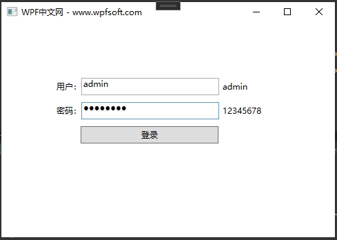
最后,F5运行调试结果如下
当前课程源码下载:(注明:本站所有源代码请按标题搜索)
文件名:085-《PasswordBox与附加属性实战》-源代码.rar
链接:https://pan.baidu.com/s/1yu-q4tUtl0poLVgmcMfgBA
提取码:wpff
——重庆教主 2023年10月26