 WPF中文网
通常,我们会在自定义类型中去定义一个依赖属性,比如UserControl用户控件。
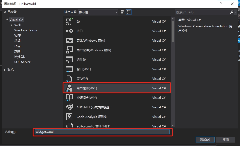
第一步,创建一个新的用户控件,取名为Widget。
第二步,我们在Widget的前端代码中进行控件布局。
<UserControl x:Class="HelloWorld.Controls.Widget"
             xmlns="http://schemas.microsoft.com/winfx/2006/xaml/presentation"
             xmlns:x="http://schemas.microsoft.com/winfx/2006/xaml"
             xmlns:mc="http://schemas.openxmlformats.org/markup-compatibility/2006"
             xmlns:d="http://schemas.microsoft.com/expression/blend/2008"
             xmlns:local="clr-namespace:HelloWorld.Controls"
             mc:Ignorable="d"
             x:Name="userControl"
             FontSize="30"
             Foreground="#666666"
             BorderBrush="#8CDDCD"
             d:DesignHeight="450"
             d:DesignWidth="800">
    <Border BorderBrush="{Binding ElementName=userControl,Path=BorderBrush}">
        <Border.Style>
            <Style TargetType="Border">
                <Setter Property="Padding" Value="10"/>
                <Setter Property="Background" Value="White"/>
                <Setter Property="BorderBrush" Value="#8CDDCD"/>
                <Setter Property="BorderThickness" Value="0 3 0 0"/>
                <Setter Property="Margin" Value="5"/>
                <Style.Triggers>
                    <Trigger Property="IsMouseOver" Value="True">
                        <Setter Property="Background" Value="#F7F9F9"/>
                    </Trigger>
                </Style.Triggers>
            </Style>
        </Border.Style>
        <Grid>
            <Grid.ColumnDefinitions>
                <ColumnDefinition/>
                <ColumnDefinition Width="auto"/>
            </Grid.ColumnDefinitions>
            <Grid.RowDefinitions>
                <RowDefinition/>
                <RowDefinition/>
            </Grid.RowDefinitions>
            <TextBlock Grid.Row="0" Grid.Column="0" Text="{Binding Value}"
                       Foreground="{Binding ElementName=userControl,Path=Foreground}"
                       FontSize="{Binding ElementName=userControl,Path=FontSize}" />
            <TextBlock Grid.Row="1" Grid.Column="0" Text="{Binding Title}"
                       Foreground="{Binding ElementName=userControl,Path=Foreground}"
                       FontSize="14" TextWrapping="Wrap"/>
            <TextBlock Grid.Row="0" Grid.Column="1" Text="{Binding Icon}"
                       Foreground="{Binding ElementName=userControl,Path=BorderBrush}"
                       FontSize="26" Grid.RowSpan="2" VerticalAlignment="Center"/>
        </Grid>
    </Border>
</UserControl>
在这里,我们一共实例化了5个控件,最外层的Border控件用来做修饰,且它的边框颜色绑定了当前UserControl控件的边框颜色。Grid里面有3个TextBlock文字块控件,其中的前景色、字号也分别绑定了当前UserControl的属性。这样做的好处是,将来实例化这个Widget自定义用户控件时,我们就可以设置它的相关属性,从而改变内部的边框颜色、字体颜色和字体大小。
需要注意的是,3个TextBlock控件Text属性分别绑定了Value、Title、Icon三个属性,这三个属性就是我们要去自定义的依赖属性。
第三步,定义依赖属性。
using System;
using System.Collections.Generic;
using System.Linq;
using System.Text;
using System.Threading.Tasks;
using System.Windows;
using System.Windows.Controls;
using System.Windows.Data;
using System.Windows.Documents;
using System.Windows.Input;
using System.Windows.Media;
using System.Windows.Media.Imaging;
using System.Windows.Navigation;
using System.Windows.Shapes;

namespace HelloWorld.Controls
{
    /// <summary>
    /// Widget.xaml 的交互逻辑
    /// </summary>
    public partial class Widget : UserControl
    {
        public Widget()
        {
            InitializeComponent();

            DataContext = this;
        }


        public string Icon
        {
            get { return (string)GetValue(IconProperty); }
            set { SetValue(IconProperty, value); }
        }

        public static readonly DependencyProperty IconProperty =
            DependencyProperty.Register("Icon", typeof(string), typeof(Widget), new PropertyMetadata("☻"));


        public string Title
        {
            get { return (string)GetValue(TitleProperty); }
            set { SetValue(TitleProperty, value); }
        }

        public static readonly DependencyProperty TitleProperty =
            DependencyProperty.Register("Title", typeof(string), typeof(Widget), new PropertyMetadata("请输入标题"));


        public string Value
        {
            get { return (string)GetValue(ValueProperty); }
            set { SetValue(ValueProperty, value); }
        }

        public static readonly DependencyProperty ValueProperty =
            DependencyProperty.Register("Value", typeof(string), typeof(Widget), new PropertyMetadata("内容"));
    }
}
通过在C#后端输入propdp,再按下tab键,VS会自动创建依赖属性的定义模板代码,我们只需要修改模板中的属性类型、属性名、和注册依赖属性时的相关参数即可。如上述代码所示,这里分别注册了IconProperty、TitleProperty和ValueProperty三个依赖属性,并且将它们注册到Widget类型上。由于依赖属性天生具有属性通知功能,所以我们不必去实现INotifyPropertyChanged接口,只需要将当前类做为ViewModel传给Widget的DataContent,前端的控件就可以绑定Value、Title、Icon三个属性了。
第四步,使用自定义控件
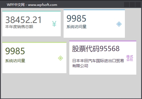
我们回到MainWindow.xaml代码中,并实例化4个Widget自定义控件。
<Window x:Class="HelloWorld.MainWindow"
        xmlns="http://schemas.microsoft.com/winfx/2006/xaml/presentation"
        xmlns:x="http://schemas.microsoft.com/winfx/2006/xaml"
        xmlns:d="http://schemas.microsoft.com/expression/blend/2008"
        xmlns:mc="http://schemas.openxmlformats.org/markup-compatibility/2006"
        xmlns:local="clr-namespace:HelloWorld" xmlns:controls="clr-namespace:HelloWorld.Controls"
        mc:Ignorable="d" Background="LightGray"
        Title="WPF中文网 - www.wpfsoft.com" Height="350" Width="500">
    <StackPanel>
        <StackPanel Orientation="Horizontal">
            <controls:Widget Icon="¥"
                             Title="本年度销售总额"
                             Value="38452.21"
                             Width="215"
                             Height="100"/>
            <controls:Widget Icon="◈"
                             Title="系统访问量"
                             Value="9985"
                             Foreground="#415767"
                             BorderBrush="#87BEE4"
                             Width="225"
                             Height="110"/>
        </StackPanel>
        <StackPanel Orientation="Horizontal">
            <controls:Widget Icon="◈"
                             Title="系统访问量"
                             Value="9985"
                             Foreground="#495E26"
                             BorderBrush="#C1E487"
                             Width="235"
                             Height="120"/>
            <controls:Widget Icon="㍿"
                             Title="日本丰田汽车国际进出口贸易有限公司"
                             Value="股票代码95568"
                             Foreground="#4E3A55"
                             BorderBrush="#CB87E4"
                             FontSize="24"
                             Width="245"
                             Height="130"/>
        </StackPanel>
    </StackPanel>

</Window>
在实例化Widget自定义控件后,设置依赖属性不同的值,控件就会绘制不同的呈现效果。
而且,Widget中的Value、Title、Icon三个属性还支持绑定功能,在本例中是直接赋值。关于依赖属性的初步了解,我们就先介绍到这里,下一讲,我们将更深入一些,去了解关于依赖属性的回调函数的用法。
当前课程源码下载:(注明:本站所有源代码请按标题搜索)
文件名:083-《DependencyProperty定义与使用》-源代码.rar
链接:https://pan.baidu.com/s/1yu-q4tUtl0poLVgmcMfgBA
提取码:wpff
——重庆教主 2023年10月26日
若文章对您有帮助,可以激励一下我哦,祝您平安幸福!
| 微信 | 支付宝 |
|---|---|
 |
 |