 WPF中文网
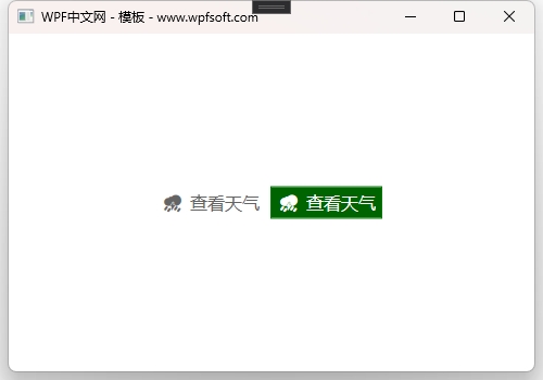
我们以Button按钮为例,演示其模板和样式的用法。首先我们定义两个样式,并在样式中定义了Button的控件模板(ControlTemplate)。
第一个样式
<Style x:Key="ButtonIconStyle" TargetType="Button">
    <Setter Property="Background"  Value="Transparent"/>
    <Setter Property="Foreground" Value="#646464"/>
    <Setter Property="FontSize" Value="16"/>
    <Setter Property="Height" Value="30"/>
    <Setter Property="Template">
        <Setter.Value>
            <ControlTemplate TargetType="Button">
                <Border Background="{TemplateBinding Background}"
                        CornerRadius="5"
                        Margin="0"
                        Height="{TemplateBinding Height}">
                    <Grid HorizontalAlignment="Center"
                          VerticalAlignment="Center">
                        <Grid.ColumnDefinitions>
                            <ColumnDefinition Width="auto"/>
                            <ColumnDefinition/>
                        </Grid.ColumnDefinitions>
                        <TextBlock Grid.Column="0" Text="{TemplateBinding Tag}"
                                   FontSize="{TemplateBinding FontSize}"
                                   Foreground="{TemplateBinding Foreground}"
                                   Margin="5 5 5 5"
                                   HorizontalAlignment="Center"
                                   VerticalAlignment="Center"/>
                        <TextBlock Grid.Column="1"
                                   Text="{TemplateBinding Content}"
                                   FontSize="{TemplateBinding FontSize}"
                                   Foreground="{TemplateBinding Foreground}"
                                   Margin="0 5 5 5"
                                   HorizontalAlignment="Center"
                                   VerticalAlignment="Center"/>
                    </Grid>
                </Border>
                <ControlTemplate.Triggers>
                    <Trigger Property="IsMouseOver" Value="True">
                        <Setter Property="Background" Value="LightPink"/>
                    </Trigger>
                    <Trigger Property="IsMouseOver" Value="False">
                        <Setter Property="Background" Value="Transparent"/>
                    </Trigger>
                </ControlTemplate.Triggers>
            </ControlTemplate>
        </Setter.Value>
    </Setter>
</Style>
在上面的样式中,我们在Template属性中实例化了一个ControlTemplate控件模板,为Button的模板(可视化树)定义了一个Border装饰器,为了实现图文按钮效果,所以在里面实例化了一个Grid,以及两个TextBlock,使用TemplateBinding将Button的属性与可视化树中的控件的属性进行模板绑定,巧妙的利用Button的Tag属性作为图标显示。最后,在ControlTemplate中实例化了两个触发器,条件是鼠标移上去或移开,改变Button的背景颜色。
第二个样式
<Style x:Key="ButtonIconBorderStyle" TargetType="Button">
    <Setter Property="Background"  Value="Transparent"/>
    <Setter Property="Foreground" Value="#646464"/>
    <Setter Property="FontSize" Value="16"/>
    <Setter Property="Height" Value="30"/>
    <Setter Property="Margin" Value="5"/>
    <Setter Property="Template">
        <Setter.Value>
            <ControlTemplate TargetType="Button">
                <Border Background="{TemplateBinding Background}"
                        BorderBrush="{TemplateBinding BorderBrush}"
                        BorderThickness="{TemplateBinding BorderThickness}"
                        CornerRadius="0"
                        Margin="0"
                        Height="{TemplateBinding Height}">
                    <Grid HorizontalAlignment="Center"
                          VerticalAlignment="Center">
                        <Grid.ColumnDefinitions>
                            <ColumnDefinition Width="auto"/>
                            <ColumnDefinition/>
                        </Grid.ColumnDefinitions>
                        <TextBlock Grid.Column="0" Text="{TemplateBinding Tag}"
                                   FontSize="{TemplateBinding FontSize}"
                                   Foreground="{TemplateBinding Foreground}"
                                   Margin="5 5 5 5"
                                   HorizontalAlignment="Center"
                                   VerticalAlignment="Center"/>
                        <TextBlock Grid.Column="1"
                                   Text="{TemplateBinding Content}"
                                   FontSize="{TemplateBinding FontSize}"
                                   Foreground="{TemplateBinding Foreground}"
                                   Margin="0 5 5 5"
                                   HorizontalAlignment="Center"
                                   VerticalAlignment="Center"/>
                    </Grid>
                </Border>
                <ControlTemplate.Triggers>
                    <Trigger Property="IsMouseOver" Value="True">
                        <Setter Property="Background" Value="DarkGreen"/>
                        <Setter Property="BorderBrush" Value="Green"/>
                        <Setter Property="Foreground" Value="White"/>
                    </Trigger>
                    <Trigger Property="IsMouseOver" Value="False">
                        <Setter Property="Background" Value="Transparent"/>
                    </Trigger>
                </ControlTemplate.Triggers>
            </ControlTemplate>
        </Setter.Value>
    </Setter>
</Style>
我们在第一种样式的基础之上进行了细节优化,绑定了Button的边框到可视化树中的Border控件上,并优化了触发器的设置,从而形成不同的按钮呈现。最后我们来看一下两个按钮的呈现效果。
当前课程源码下载:(注明:本站所有源代码请按标题搜索)
文件名:070-《Button模板样式实战》-源代码
链接:https://pan.baidu.com/s/1yu-q4tUtl0poLVgmcMfgBA
提取码:wpff
——重庆教主 2023年10月9日
众所周知,ListBox继承于ItemsControl控件,那么,它就与ItemsControl一样,拥有了可以设置的数据模板。当然,它也可以拥有自己的控件模板(在Control基类中定义的Template)。这一节,我们只探讨一下ListBox如何使用数据模板。
我们可以将上一章节中的ItemsControl直接改成ListBox。
<ListBox ItemsSource="{Binding Persons}" >
    <ItemsControl.ItemsPanel>
        <ItemsPanelTemplate>
            <WrapPanel/>
        </ItemsPanelTemplate>
    </ItemsControl.ItemsPanel>
    <ItemsControl.ItemTemplate>
        <DataTemplate>
            <Border x:Name="border"
                    Width="280"
                    Height="200"
                    Margin="5"
                    BorderThickness="1"
                    BorderBrush="Gray">
                <Grid>
                    <Grid.RowDefinitions>
                        <RowDefinition/>
                        <RowDefinition/>
                    </Grid.RowDefinitions>
                    <StackPanel Grid.Row="0" Margin="20">
                        <TextBlock Text="{Binding Name}" FontWeight="Bold" FontSize="20"/>
                        <Rectangle Height="5"/>
                        <TextBlock Text="{Binding Occupation}" FontSize="16"/>
                    </StackPanel>
                    <StackPanel Grid.Row="1" Orientation="Horizontal">
                        <TextBlock Grid.Column="0" Text="☻"
                                       VerticalAlignment="Center"  Margin="20"
                                       FontSize="50" Foreground="#E26441"/>
                        <StackPanel Margin="30 0 0 0" Width="150">
                            <TextBlock Text="COMPANY NAME"/>
                            <TextBlock Text="Age:">
                                    <Run Text="{Binding Age}"/>
                            </TextBlock>
                            <TextBlock Text="Money:">
                                    <Run Text="{Binding Money, StringFormat={}{0:C}}"/>
                            </TextBlock>
                            <TextBlock Text="Address:" TextWrapping="Wrap">
                                    <Run Text="{Binding Address}"/>
                            </TextBlock>
                        </StackPanel>
                    </StackPanel>
                </Grid>
            </Border>
            <DataTemplate.Triggers>
                <Trigger Property="IsMouseOver" Value="True">
                    <Setter Property="Background" Value="#7AAB7D" TargetName="border" />
                </Trigger>
            </DataTemplate.Triggers>
        </DataTemplate>
    </ItemsControl.ItemTemplate>
</ListBox>
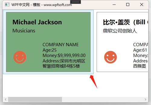
因为ListBox是ItemsControl的子类,所以,这样的修改是没有问题的。只不过,如上图所示,在每个元素的外围,当鼠标移上去时,会出现一个淡蓝色的边框区域,这是为何呢?
这是因为在ListBox的父类ItemsControl中定义了一个ItemContainerStyle的样式,这个样式决定了ListBox控件中每个元素的容器外观。原来,在集合控件中,并不是说将一堆元素直接丢到里面呈现,而是先给每个元素分配一个容器,再将它们呈现在集合控件中。就好比给每个学生发一套校服,穿好后再规规距距地坐在教室里。
既然如此,那我们就可以给每个学生重新发一套校服,或者干脆不穿校服——毕竟每个学生自己都穿了衣服的(数据模板)。
<ListBox.ItemContainerStyle>
    <Style TargetType="ListBoxItem">
        <Setter Property="Template">
            <Setter.Value>
                <ControlTemplate TargetType="ListBoxItem">
                    <ContentPresenter/>
                </ControlTemplate>
            </Setter.Value>
        </Setter>
    </Style>
</ListBox.ItemContainerStyle>
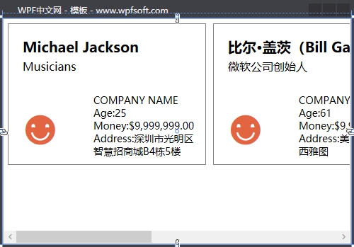
ItemContainerStyle的Template的内容必须是ControlTemplate (控件模板)。这里同样使用了ContentPresenter,我们已然在前面讲过,这里指的是,将来由每个元素进行替换。注意TargetType是ListBoxItem类型。因为这个校服的品牌方就是指ListBox的ListBoxItem元素。
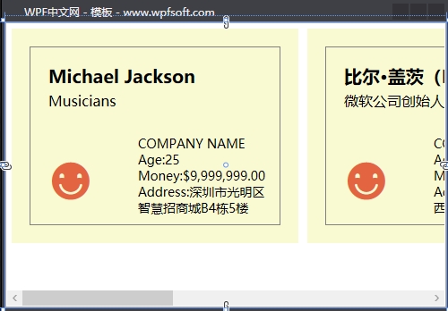
如果我们要给每个学生穿一件金黄色的衣服,如下所示
<ListBox.ItemContainerStyle>
    <Style TargetType="ListBoxItem">
        <Setter Property="Template">
            <Setter.Value>
                <ControlTemplate TargetType="ListBoxItem">
                    <Border Background="LightGoldenrodYellow"
                            Padding="15" Margin="5">
                        <ContentPresenter/>
                    </Border>
                </ControlTemplate>
            </Setter.Value>
        </Setter>
    </Style>
</ListBox.ItemContainerStyle>
当前课程源码下载:(注明:本站所有源代码请按标题搜索)
文件名:068-《ListBox的ItemContainerStyle》-源代码
链接:https://pan.baidu.com/s/1yu-q4tUtl0poLVgmcMfgBA
提取码:wpff
一、控件模板概述
在前面的章节中,我们介绍了逻辑树和可视化树,界面通常由多个控件构成,多个控件会构成一个树,这棵树就是逻辑树,逻辑树指界面上所有控件的组织关系;而每个控件内部也有一定的组织关系(可视化树),这个组织关系定义了控件的结构和外观。WPF为每个控件的定义了一个默认的结构外观,也就是默认的控件模板。
在进一步学习控件模板之前,我们先了解一下模板与样式的区别。
比如一个人的肤色、臂长、身高、五官等,这个可以通过样式设定,所以大街上我们可以看到形形色色的人,有的是白种人,有的是黄种人,有的身高1米5,有的身高2米,有的五官好看,有的不好看。但是这些人都有皮肤、两只手、两只眼睛等等。这是因为他们的模板都是相同的。
咦?那有的人生下来就只有一只手,或者一只眼,这做何解释?这就是因为他的模板与大多数人不一样。
我们再以WPF中的Button为例。默认情况下,Button按钮的内容只能显示文字,我们可以设置它的Content属性即可。也可以设置它的Width和Height,改变它的尺寸,但是,它始终是一个矩形的按钮。假如我们希望得到一个圆形的按钮、或者带图标的按钮,这个时候就需要去改变按钮的内部结构外观——ControlTemplate控件模板。
FrameworkElement基类有一个Template属性就是指控件的ControlTemplate模板,这就意味着,几乎所有的WPF控件都是可以修改它的结构和外观(可视化树)的。注意,不能仅替换控件的可视化树的一部分;若要更改控件的可视化树,必须将该控件的 Template 属性设置为新的完整 ControlTemplate。
二、查看控件的默认模板
下面的操作演示了如何查看控件的默认模板。
比如我们有一个Button按钮,在设计界面中用鼠标单击右键-编辑模板-编辑副本。
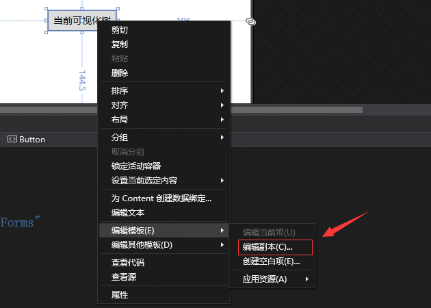
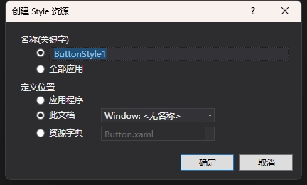
此时,会弹出一个对话框,如下所示。名称表示定义当前按钮的样式key的名称,定义位置默认在此文档中,于是会生成当前按钮的默认样式。我们可以从当前按钮的默认样式中找到它内部的可视化树——控件模板。
这些模板样式代码会生成到Window.Resources中。代码如下
    <Window.Resources>
        <Style x:Key="FocusVisual">
            <Setter Property="Control.Template">
                <Setter.Value>
                    <ControlTemplate>
                        <Rectangle Margin="2" SnapsToDevicePixels="true" Stroke="{DynamicResource {x:Static SystemColors.ControlTextBrushKey}}" StrokeThickness="1" StrokeDashArray="1 2"/>
                    </ControlTemplate>
                </Setter.Value>
            </Setter>
        </Style>
        <SolidColorBrush x:Key="Button.Static.Background" Color="#FFDDDDDD"/>
        <SolidColorBrush x:Key="Button.Static.Border" Color="#FF707070"/>
        <SolidColorBrush x:Key="Button.MouseOver.Background" Color="#FFBEE6FD"/>
        <SolidColorBrush x:Key="Button.MouseOver.Border" Color="#FF3C7FB1"/>
        <SolidColorBrush x:Key="Button.Pressed.Background" Color="#FFC4E5F6"/>
        <SolidColorBrush x:Key="Button.Pressed.Border" Color="#FF2C628B"/>
        <SolidColorBrush x:Key="Button.Disabled.Background" Color="#FFF4F4F4"/>
        <SolidColorBrush x:Key="Button.Disabled.Border" Color="#FFADB2B5"/>
        <SolidColorBrush x:Key="Button.Disabled.Foreground" Color="#FF838383"/>
        <Style x:Key="ButtonStyle1" TargetType="{x:Type Button}">
            <Setter Property="FocusVisualStyle" Value="{StaticResource FocusVisual}"/>
            <Setter Property="Background" Value="{StaticResource Button.Static.Background}"/>
            <Setter Property="BorderBrush" Value="{StaticResource Button.Static.Border}"/>
            <Setter Property="Foreground" Value="{DynamicResource {x:Static SystemColors.ControlTextBrushKey}}"/>
            <Setter Property="BorderThickness" Value="1"/>
            <Setter Property="HorizontalContentAlignment" Value="Center"/>
            <Setter Property="VerticalContentAlignment" Value="Center"/>
            <Setter Property="Padding" Value="1"/>
            <Setter Property="Template">
                <Setter.Value>
                    <ControlTemplate TargetType="{x:Type Button}">
                        <Border x:Name="border" BorderBrush="{TemplateBinding BorderBrush}" BorderThickness="{TemplateBinding BorderThickness}" Background="{TemplateBinding Background}" SnapsToDevicePixels="true">
                            <ContentPresenter x:Name="contentPresenter" Focusable="False" HorizontalAlignment="{TemplateBinding HorizontalContentAlignment}" Margin="{TemplateBinding Padding}" RecognizesAccessKey="True" SnapsToDevicePixels="{TemplateBinding SnapsToDevicePixels}" VerticalAlignment="{TemplateBinding VerticalContentAlignment}"/>
                        </Border>
                        <ControlTemplate.Triggers>
                            <Trigger Property="IsDefaulted" Value="true">
                                <Setter Property="BorderBrush" TargetName="border" Value="{DynamicResource {x:Static SystemColors.HighlightBrushKey}}"/>
                            </Trigger>
                            <Trigger Property="IsMouseOver" Value="true">
                                <Setter Property="Background" TargetName="border" Value="{StaticResource Button.MouseOver.Background}"/>
                                <Setter Property="BorderBrush" TargetName="border" Value="{StaticResource Button.MouseOver.Border}"/>
                            </Trigger>
                            <Trigger Property="IsPressed" Value="true">
                                <Setter Property="Background" TargetName="border" Value="{StaticResource Button.Pressed.Background}"/>
                                <Setter Property="BorderBrush" TargetName="border" Value="{StaticResource Button.Pressed.Border}"/>
                            </Trigger>
                            <Trigger Property="IsEnabled" Value="false">
                                <Setter Property="Background" TargetName="border" Value="{StaticResource Button.Disabled.Background}"/>
                                <Setter Property="BorderBrush" TargetName="border" Value="{StaticResource Button.Disabled.Border}"/>
                                <Setter Property="TextElement.Foreground" TargetName="contentPresenter" Value="{StaticResource Button.Disabled.Foreground}"/>
                            </Trigger>
                        </ControlTemplate.Triggers>
                    </ControlTemplate>
                </Setter.Value>
            </Setter>
        </Style>
    </Window.Resources>
在前面的章节中,我们已了解过样式的写法,在这里,我们关注一下Setter项目设置Template属性的写法,因为Template属性是ContorlTemplate类型,所以在上面的代码中实例化了一个ControlTemplate对象,并且,TargetType="{x:Type Button}",表示这个ContorlTemplate实例是给Button定义的模板。
而在ContorlTemplate对象中,定义了一棵可视化树。
<Border x:Name="border"
        BorderBrush="{TemplateBinding BorderBrush}"
        BorderThickness="{TemplateBinding BorderThickness}"
        Background="{TemplateBinding Background}"
        SnapsToDevicePixels="true">
    <ContentPresenter x:Name="contentPresenter"
                      Focusable="False"
                      HorizontalAlignment="{TemplateBinding HorizontalContentAlignment}"
                      Margin="{TemplateBinding Padding}"
                      RecognizesAccessKey="True"
                      SnapsToDevicePixels="{TemplateBinding SnapsToDevicePixels}"
                      VerticalAlignment="{TemplateBinding VerticalContentAlignment}"/>
</Border>
这里定义了一个Border装修器,里面有一个ContentPresenter对象。什么是ContentPresenter对象?
三、什么是ContentPresenter对象?
ContentPresenter继承于FrameworkElement,说明它也是一个控件。从命名上看,它叫内容主持者,本质上它只是一个占座的,为谁占座?为ContentControl内容控件占座。因为Button继承于ContentControl,所以Button也有Content属性,在ContentTemplate中的ContentPresenter可视为等于Content属性。
友情提示
ContentPresenter 定义边框属性,使你无需使用其他 Border 元素即可在 ContentPresenter 周围绘制 边框 。 属性为 ContentPresenter.BorderBrush、 ContentPresenter.BorderThickness、 ContentPresenter.CornerRadius 和 ContentPresenter.Padding。
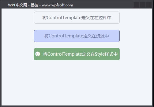
四、控件模板的几种设置方式
4.1将ControlTemplate定义在在控件中
<Button Content="将ControlTemplate定义在在控件中"
        Width="280" Height="40" Margin="10" Foreground="#747787">
    <Button.Template>
        <ControlTemplate TargetType="Button">
            <Border Background="Transparent" CornerRadius="5" BorderThickness="1" BorderBrush="#C9CCD5">
                <ContentPresenter  HorizontalAlignment="Center" VerticalAlignment="Center"/>
            </Border>
        </ControlTemplate>
    </Button.Template>
</Button>
4.2将ControlTemplate定义在资源中
<Window.Resources>
    <ControlTemplate x:Key="ButtonTemplate" TargetType="Button">
        <Border Background="#C6D2FC" CornerRadius="5" BorderThickness="1" BorderBrush="#545BAD">
            <ContentPresenter  HorizontalAlignment="Center" VerticalAlignment="Center"/>
        </Border>
    </ControlTemplate>
</Window.Resources>

<Button Content="将ControlTemplate定义在资源中"
        Template="{StaticResource ButtonTemplate}"
        Width="280" Height="40" Margin="10" Foreground="#707CA5"/>
4.3将ControlTemplate定义在Style样式中
<Button Content="将ControlTemplate定义在Style样式中"
        Width="280" Height="40" Margin="10" Foreground="White">
    <Button.Style>
        <Style TargetType="Button">
            <Setter Property="Template">
                <Setter.Value>
                    <ControlTemplate TargetType="Button">
                        <Border Background="#7AAB7D" CornerRadius="5">
                            <Grid>
                                <Grid.ColumnDefinitions>
                                    <ColumnDefinition Width="auto"/>
                                    <ColumnDefinition/>
                                </Grid.ColumnDefinitions>
                                <TextBlock Grid.Column="0" Text="☻"
                                           VerticalAlignment="Center"
                                           Margin="3" FontSize="18"/>
                                <ContentPresenter Grid.Column="1"
                                                  HorizontalAlignment="Center"
                                                  VerticalAlignment="Center"/>
                            </Grid>
                        </Border>
                    </ControlTemplate>
                </Setter.Value>
            </Setter>
        </Style>
    </Button.Style>
</Button>
上面三种方式,都可以去定义控件的ContentTemplate,不同的定义方式,可见度不一样而已。比如第一种定义方式,只能是当前那个控件私有,第二种定义方式,它就是一个公有的模板实例。
当前课程源码下载:(注明:本站所有源代码请按标题搜索)
文件名:063-《ControlTemplate控件模板》-源代码
链接:https://pan.baidu.com/s/1yu-q4tUtl0poLVgmcMfgBA
提取码:wpff
——重庆教主 2023年9月28日
每个控件都有自己的视觉外观,比如,我们一眼就能分清楚Button和CheckBox两个按钮。为什么?那是因为这两种按钮呈现出来的外观完全不一样。WPF为每一种控件都提供了一个默认的视觉外观,同时支持开发者去重写这个视觉外观,只需要将重写的视觉外观赋值到Template属性即可——这就是Template模板的由来。
模块定义了控件的视觉外观。
在前面的章节中,我们了解到WPF的控件大致也是可分为好几种,比如以Panel为基类的那些布局控件,以ContentControl为基类的那些内容控件,以ItemsControl为基类的那些集合控件,这些不同种类的控件都有各自的视觉外观,同时也说明它们都有不同的模板。
一谈到“不同的模板”,那肯定有相同的地方,以OOP的思想,这些不同的模板肯定会继承同一个基类。是的没错,WPF的模板基类叫FrameworkTemplate,它是一个抽象类,它有三个子类,分别是ControlTemplate(控件模板)、ItemsPanelTemplate(元素面板模板)和DataTemplate(数据模板)。
ControlTemplate控件模板用于定义控件的外观,也就是Control基类的Template属性,而绝大多数控件都继承于Control基类,意味着我们都可以去重新定义它们的视觉外观。
DataTemplate数据模板即数据的外衣。用于从一个对象中提取数据,并在内容控件或列表控件的各个项中显示数据。比如ContentControl基类中的ContentTemplate属性,或者集合控件ItemsControl基类ItemTemplate属性,它们都是DataTemplate数据模板,用来定义数据的外观(数据的呈现形式)。
ItemsPanelTemplate元素面板模板也是用于ItemsControl控件或ItemsControl的子类控件中,因为在集合控件中要考虑每个元素之间的布局方式,所以可以采用ItemsPanelTemplate去定义。ItemsControl基类有一个ItemsPanel属性,它就是一个ItemsPanelTemplate模板。
一、FrameworkTemplate基类
public abstract class FrameworkTemplate : DispatcherObject, INameScope, ISealable, IHaveResources, IQueryAmbient
{
    protected FrameworkTemplate();

    public bool IsSealed { get; }
    public FrameworkElementFactory VisualTree { get; set; }
    public TemplateContent Template { get; set; }
    public ResourceDictionary Resources { get; set; }
    public bool HasContent { get; }

    public object FindName(string name, FrameworkElement templatedParent);
    public DependencyObject LoadContent();
    public void RegisterName(string name, object scopedElement);
    public void Seal();
    public bool ShouldSerializeResources(XamlDesignerSerializationManager manager);
    public bool ShouldSerializeVisualTree();
    public void UnregisterName(string name);
    protected virtual void ValidateTemplatedParent(FrameworkElement templatedParent);

}FrameworkTemplate基类有一个VisualTree属性,这是我们首次看到“视觉树”这个关键词,实际上,WPF拥有两棵树,即逻辑树(LogicalTree)和视觉树(VisualTree),并提供了两个帮助类,LogicalTreeHelper 和 VisualTreeHelper。前者提供用于查询逻辑树中的对象的静态帮助器方法。后者提供一些实用工具方法,用于执行涉及可视化树中的节点的常规任务。
接下来,我们将分享这两棵树的内容。
——重庆教主 2023年9月20日