 WPF中文网
ScrollBar表示一个滚动条,该滚动条具有一个滑动 Thumb,其位置对应于一个值。它继承于RangeBase抽象基类,RangeBase基类继承于Control基类。带滚动特质的还有两个控件,也继承于RangeBase抽象基类,它们分别是ProgressBar(进度条)和Slider(滑动条)。待我们探讨完ScrollBar,再来探讨ProgressBar和Slider。
一、RangeBase抽象基类定义
public abstract class RangeBase : Control
{
    public static readonly RoutedEvent ValueChangedEvent;
    public static readonly DependencyProperty MinimumProperty;
    public static readonly DependencyProperty MaximumProperty;
    public static readonly DependencyProperty ValueProperty;
    public static readonly DependencyProperty LargeChangeProperty;
    public static readonly DependencyProperty SmallChangeProperty;

    protected RangeBase();

    public double LargeChange { get; set; }
    public double SmallChange { get; set; }
    public double Value { get; set; }
    public double Maximum { get; set; }
    public double Minimum { get; set; }

    public event RoutedPropertyChangedEventHandler<double> ValueChanged;

    public override string ToString();
    protected virtual void OnMaximumChanged(double oldMaximum, double newMaximum);
    protected virtual void OnMinimumChanged(double oldMinimum, double newMinimum);
    protected virtual void OnValueChanged(double oldValue, double newValue);

}
RangeBase 只有5个属性
| 属性名称 | 说明 |
| LargeChange | 表示给Value属性加减的最大值。默认为1 |
| SmallChange | 表示给Value属性加减的最小值。默认为0.1 |
| Value | 获取或设置范围控件的当前数量。默认为0 |
| Maximum | 获取或设置Value属性的最大值 |
| Minimum | 获取或设置Value属性的最小值 |
RangeBase事件成员
ValueChanged:当前Value属性发生改变时触发的事件。
总结,ScrollBar、ProgressBar和Slider都将继承上面的属性、方面与事件成员。
二、ScrollBar类定义
public class ScrollBar : RangeBase
{
    public static readonly RoutedEvent ScrollEvent;
    public static readonly RoutedCommand ScrollHereCommand;
    public static readonly RoutedCommand DeferScrollToVerticalOffsetCommand;
    public static readonly RoutedCommand DeferScrollToHorizontalOffsetCommand;
    public static readonly RoutedCommand ScrollToVerticalOffsetCommand;
    public static readonly RoutedCommand ScrollToHorizontalOffsetCommand;
    public static readonly RoutedCommand ScrollToTopCommand;
    public static readonly RoutedCommand ScrollToLeftEndCommand;
    public static readonly RoutedCommand ScrollToRightEndCommand;
    public static readonly RoutedCommand ScrollToHomeCommand;
    public static readonly RoutedCommand ScrollToEndCommand;
    public static readonly RoutedCommand ScrollToBottomCommand;
    public static readonly RoutedCommand PageLeftCommand;
    public static readonly RoutedCommand PageDownCommand;
    public static readonly RoutedCommand PageUpCommand;
    public static readonly RoutedCommand LineRightCommand;
    public static readonly RoutedCommand PageRightCommand;
    public static readonly RoutedCommand LineLeftCommand;
    public static readonly RoutedCommand LineDownCommand;
    public static readonly RoutedCommand LineUpCommand;
    public static readonly DependencyProperty ViewportSizeProperty;
    public static readonly DependencyProperty OrientationProperty;

    public ScrollBar();

    public Orientation Orientation { get; set; }
    public double ViewportSize { get; set; }
    public Track Track { get; }
    protected override bool IsEnabledCore { get; }

    public event ScrollEventHandler Scroll;

    public override void OnApplyTemplate();
    protected override void OnContextMenuClosing(ContextMenuEventArgs e);
    protected override void OnContextMenuOpening(ContextMenuEventArgs e);
    protected override AutomationPeer OnCreateAutomationPeer();
    protected override void OnPreviewMouseLeftButtonDown(MouseButtonEventArgs e);
    protected override void OnPreviewMouseRightButtonUp(MouseButtonEventArgs e);

}
ScrollBar自身有两个属性是我们必须要掌握的,那就是Orientation 和ViewportSize 。
Orientation :表示当前滚动条是水平的还是垂直的。
ViewportSize:获取或设置当前可见的可滚动内容的数量。默认值为0。
另外,它还有一个滚动事件Scroll可以使用。我们还是以实际的例子来说明它的用法吧。
前端代码
<Window x:Class="HelloWorld.MainWindow"
        xmlns="http://schemas.microsoft.com/winfx/2006/xaml/presentation"
        xmlns:x="http://schemas.microsoft.com/winfx/2006/xaml"
        xmlns:d="http://schemas.microsoft.com/expression/blend/2008"
        xmlns:mc="http://schemas.openxmlformats.org/markup-compatibility/2006"
        xmlns:local="clr-namespace:HelloWorld"
        mc:Ignorable="d" FontSize="16"
        Title="WPF中文网之控件课程 - www.wpfsoft.com" Height="350" Width="500">
    <Grid x:Name="viewport" >
        <Grid.RowDefinitions>
            <RowDefinition Height="115"/>
            <RowDefinition Height="auto"/>
            <RowDefinition/>
        </Grid.RowDefinitions>
        <Canvas>
            <StackPanel x:Name="element" Orientation="Horizontal" Canvas.Left="{Binding CanvasLeft}">
                <Border BorderBrush="LightGray" BorderThickness="1" CornerRadius="5" Padding="3" Margin="3">
                    <Image Source="pack://application:,,,/Images/logo.png" Width="100" Height="100"/>
                </Border>
                <Border BorderBrush="LightGray" BorderThickness="1" CornerRadius="5" Padding="3" Margin="3">
                    <Image Source="pack://application:,,,/Images/logo.png" Width="100" Height="100"/>
                </Border>
                <Border BorderBrush="LightGray" BorderThickness="1" CornerRadius="5" Padding="3" Margin="3">
                    <Image Source="pack://application:,,,/Images/logo.png" Width="100" Height="100"/>
                </Border>
                <Border BorderBrush="LightGray" BorderThickness="1" CornerRadius="5" Padding="3" Margin="3">
                    <Image Source="pack://application:,,,/Images/logo.png" Width="100" Height="100"/>
                </Border>
                <Border BorderBrush="LightGray" BorderThickness="1" CornerRadius="5" Padding="3" Margin="3">
                    <Image Source="pack://application:,,,/Images/logo.png" Width="100" Height="100"/>
                </Border>
                <Border BorderBrush="LightGray" BorderThickness="1" CornerRadius="5" Padding="3" Margin="3">
                    <Image Source="pack://application:,,,/Images/logo.png" Width="100" Height="100"/>
                </Border>
                <Border BorderBrush="LightGray" BorderThickness="1" CornerRadius="5" Padding="3" Margin="3">
                    <Image Source="pack://application:,,,/Images/logo.png" Width="100" Height="100"/>
                </Border>
                <Border BorderBrush="LightGray" BorderThickness="1" CornerRadius="5" Padding="3" Margin="3">
                    <Image Source="pack://application:,,,/Images/logo.png" Width="100" Height="100"/>
                </Border>
                <Border BorderBrush="LightGray" BorderThickness="1" CornerRadius="5" Padding="3" Margin="3">
                    <Image Source="pack://application:,,,/Images/logo.png" Width="100" Height="100"/>
                </Border>
                <Border BorderBrush="LightGray" BorderThickness="1" CornerRadius="5" Padding="3" Margin="3">
                    <Image Source="pack://application:,,,/Images/logo.png" Width="100" Height="100"/>
                </Border>
                <Border BorderBrush="LightGray" BorderThickness="1" CornerRadius="5" Padding="3" Margin="3">
                    <Image Source="pack://application:,,,/Images/logo.png" Width="100" Height="100"/>
                </Border>
                <Border BorderBrush="LightGray" BorderThickness="1" CornerRadius="5" Padding="3" Margin="3">
                    <Image Source="pack://application:,,,/Images/logo.png" Width="100" Height="100"/>
                </Border>
                <Border BorderBrush="LightGray" BorderThickness="1" CornerRadius="5" Padding="3" Margin="3">
                    <Image Source="pack://application:,,,/Images/logo.png" Width="100" Height="100"/>
                </Border>
                <Border BorderBrush="LightGray" BorderThickness="1" CornerRadius="5" Padding="3" Margin="3">
                    <Image Source="pack://application:,,,/Images/logo.png" Width="100" Height="100"/>
                </Border>
                <Border BorderBrush="LightGray" BorderThickness="1" CornerRadius="5" Padding="3" Margin="3">
                    <Image Source="pack://application:,,,/Images/logo.png" Width="100" Height="100"/>
                </Border>
            </StackPanel>
        </Canvas>
        <ScrollBar Grid.Row="1" Orientation="Horizontal"
                   Maximum="{Binding Maximum}"
                   Value="{Binding X}"
                   ViewportSize="{Binding ElementName=viewport,Path=ActualWidth}"/>
        <TextBlock Grid.Row="2" Text="ScrollBar" HorizontalAlignment="Center" VerticalAlignment="Center" FontSize="24"/>
    </Grid>
</Window>
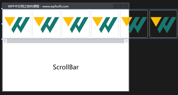
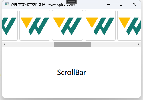
观察这个UI设计,我们故意在StackPanel控件中增加了多张图片,使其不能完全在Canvas中显示出来,然后在下面实例化了一根水平滚动条。注意滚动条的其中三个参数使用了绑定,不熟悉的小伙伴可参阅数据绑定那一章节。
Maximum:表示这根滚动条的最大值。
Value:表示滚动条的当前值。
ViewportSize:表示滚动条要作用于某个控件的宽度(这里实际上指Grid的宽度)。
最后,我们将StackPanel控件的Canvas.Left依赖属性绑定到一个CanvasLeft属性。只要CanvasLeft属性的值发生改变,那么StackPanel相对于Canvas水平位置就发生改变。
那么CanvasLeft属性是怎样发生改变的呢?这一切将在后台代码中实现。
后端代码
using System.ComponentModel;
using System.Windows;

namespace HelloWorld
{
    /// <summary>
    /// MainWindow.xaml 的交互逻辑
    /// </summary>
    public partial class MainWindow : Window,INotifyPropertyChanged
    {
        public MainWindow()
        {
            InitializeComponent();
            DataContext = this;//将当前窗体作为ViewModel赋值给当前窗体的DataContext
            Loaded += (s, e) =>
            {
                //计算滚动条的最大值
                Maximum = element.ActualWidth - viewport.ActualWidth;
            };
        }

        private double maximum = 0;
        /// <summary>
        /// 滚动条的最大值
        /// </summary>
        public double Maximum
        {
            get { return maximum; }
            set { maximum = value; NotifyPropertyChanged("Maximum"); }
        }

        private double x = 0;
        /// <summary>
        /// 滚动条的当前值
        /// </summary>
        public double X
        {
            get { return x; }
            set { x = value; CanvasLeft = -x; NotifyPropertyChanged("X"); }
        }

        private double canvasLeft = 0;
        /// <summary>
        /// 相对于Canvas控件Left边距
        /// </summary>
        public double CanvasLeft
        {
            get { return canvasLeft; }
            set { canvasLeft = value; NotifyPropertyChanged("CanvasLeft"); }
        }

        public event PropertyChangedEventHandler PropertyChanged;

        /// <summary>
        /// 属性通知方法
        /// </summary>
        /// <param name="propertyName"></param>
        protected virtual void NotifyPropertyChanged(string propertyName)
        {
            if (this.PropertyChanged != null)
            {
                this.PropertyChanged(this, new PropertyChangedEventArgs(propertyName));
            }
        }
    }
}
如上所示,我们获取到滚动条的值X,然后取反后赋值给CanvasLeft属性,而CanvasLeft属性拥有“属性通知”功能,故而前端StackPanel的相对位置会随着用户拖动滚动条而变化。
关于属性通知及INotifyPropertyChanged接口,我们将在数据绑定一章讲解。
掌握了ScrollBar的用法后,Slider控件也基本就掌握了,下一节,我们来探讨Slider。对了,如果把下面这段代码换成Slider控件,也是可以用的哦。
更换前
<ScrollBar Grid.Row="1" Orientation="Horizontal"
                   Maximum="{Binding Maximum}"
                   Value="{Binding X}"
                   ViewportSize="{Binding ElementName=viewport,Path=ActualWidth}"/>
更换后
<Slider Grid.Row="1" Maximum="{Binding Maximum}" Value="{Binding X}"/>当前课程源码下载:(注明:本站所有源代码请按标题搜索)
文件名:030-《ScrollBar滚动条》-源代码
链接:https://pan.baidu.com/s/1yu-q4tUtl0poLVgmcMfgBA
提取码:wpff
——重庆教主 2023年8月29日