 WPF中文网
每个控件都有自己的视觉外观,比如,我们一眼就能分清楚Button和CheckBox两个按钮。为什么?那是因为这两种按钮呈现出来的外观完全不一样。WPF为每一种控件都提供了一个默认的视觉外观,同时支持开发者去重写这个视觉外观,只需要将重写的视觉外观赋值到Template属性即可——这就是Template模板的由来。
模块定义了控件的视觉外观。
在前面的章节中,我们了解到WPF的控件大致也是可分为好几种,比如以Panel为基类的那些布局控件,以ContentControl为基类的那些内容控件,以ItemsControl为基类的那些集合控件,这些不同种类的控件都有各自的视觉外观,同时也说明它们都有不同的模板。
一谈到“不同的模板”,那肯定有相同的地方,以OOP的思想,这些不同的模板肯定会继承同一个基类。是的没错,WPF的模板基类叫FrameworkTemplate,它是一个抽象类,它有三个子类,分别是ControlTemplate(控件模板)、ItemsPanelTemplate(元素面板模板)和DataTemplate(数据模板)。
ControlTemplate控件模板用于定义控件的外观,也就是Control基类的Template属性,而绝大多数控件都继承于Control基类,意味着我们都可以去重新定义它们的视觉外观。
DataTemplate数据模板即数据的外衣。用于从一个对象中提取数据,并在内容控件或列表控件的各个项中显示数据。比如ContentControl基类中的ContentTemplate属性,或者集合控件ItemsControl基类ItemTemplate属性,它们都是DataTemplate数据模板,用来定义数据的外观(数据的呈现形式)。
ItemsPanelTemplate元素面板模板也是用于ItemsControl控件或ItemsControl的子类控件中,因为在集合控件中要考虑每个元素之间的布局方式,所以可以采用ItemsPanelTemplate去定义。ItemsControl基类有一个ItemsPanel属性,它就是一个ItemsPanelTemplate模板。
一、FrameworkTemplate基类
public abstract class FrameworkTemplate : DispatcherObject, INameScope, ISealable, IHaveResources, IQueryAmbient
{
    protected FrameworkTemplate();

    public bool IsSealed { get; }
    public FrameworkElementFactory VisualTree { get; set; }
    public TemplateContent Template { get; set; }
    public ResourceDictionary Resources { get; set; }
    public bool HasContent { get; }

    public object FindName(string name, FrameworkElement templatedParent);
    public DependencyObject LoadContent();
    public void RegisterName(string name, object scopedElement);
    public void Seal();
    public bool ShouldSerializeResources(XamlDesignerSerializationManager manager);
    public bool ShouldSerializeVisualTree();
    public void UnregisterName(string name);
    protected virtual void ValidateTemplatedParent(FrameworkElement templatedParent);

}FrameworkTemplate基类有一个VisualTree属性,这是我们首次看到“视觉树”这个关键词,实际上,WPF拥有两棵树,即逻辑树(LogicalTree)和视觉树(VisualTree),并提供了两个帮助类,LogicalTreeHelper 和 VisualTreeHelper。前者提供用于查询逻辑树中的对象的静态帮助器方法。后者提供一些实用工具方法,用于执行涉及可视化树中的节点的常规任务。
接下来,我们将分享这两棵树的内容。
——重庆教主 2023年9月20日
WPF使用了若干树结构形式来定义程序元素之间的关系,比如逻辑树和可视化树。要介绍逻辑树和可视化树,我们要先了解两个基类,它们分别是FrameworkElement类和Visual类,FrameworkElement类主要实现控件的布局、逻辑树、支持数据绑定和动态资源引用、控件的样式定义和动画,而Visual类更关注控件的命中测试、坐标转换和边界框计算,即控件呈现更基础的服务支持。所以,FrameworkElement类与WPF的控件“更靠近一些”,比如设置控件的宽度、高度、透明度、显示或隐藏控件,像这些由控件组成的XAML代码就是一棵逻辑树。
那么,逻辑树有什么用途呢?
官方解释
借助逻辑树,内容模型可以方便地循环访问其可能的子对象,从而实现扩展。 此外,逻辑树还为某些通知提供框架,例如在加载逻辑树中的所有对象时。 基本上,逻辑树是框架级别的近似运行时对象图(排除了视觉对象),但其足以用于对你自己的运行时应用程序组合执行多种查询操作。
此外,静态和动态资源引用具有相同的解析过程:针对最初发出请求的对象,沿逻辑树向上查找 Resources 集合,然后沿逻辑树继续向上,检查每一个 FrameworkElement 或 FrameworkContentElement,以查找另一个包含 ResourceDictionary(可能包含该键)的 Resources 值。
有时候,我们需要在后端代码中查找前端XAML某个控件,以便对控件进行某个操作,那么,就可以借助逻辑树来遍历元素。LogicalTreeHelper 类就是专门来遍历查找WPF的逻辑树的。LogicalTreeHelper 类提供用于逻辑树遍历的 GetChildren、GetParent 和 FindLogicalNode 方法。
下面,我们一个例子来说明LogicalTreeHelper 类的使用过程。
前端代码
<Window x:Class="HelloWorld.MainWindow"
        xmlns="http://schemas.microsoft.com/winfx/2006/xaml/presentation"
        xmlns:x="http://schemas.microsoft.com/winfx/2006/xaml"
        xmlns:d="http://schemas.microsoft.com/expression/blend/2008"
        xmlns:mc="http://schemas.openxmlformats.org/markup-compatibility/2006"
        xmlns:local="clr-namespace:HelloWorld"
        xmlns:forms="clr-namespace:System.Windows.Forms;assembly=System.Windows.Forms"
        mc:Ignorable="d" FontSize="14"
        Title="WPF中文网 - 模板 - www.wpfsoft.com" Height="350" Width="500">
    <Grid>
        <Grid.ColumnDefinitions>
            <ColumnDefinition Width="auto"/>
            <ColumnDefinition/>
        </Grid.ColumnDefinitions>
        <Border Grid.Column="0" x:Name="_LeftBorder" Width="188" Background="LightCyan">
            <Button Content="当前逻辑树" Click="Button_Click" HorizontalAlignment="Center" VerticalAlignment="Center"/>
        </Border>
        <Border Grid.Column="1" x:Name="_RightBorder" >
            <TreeView x:Name="_TreeView" Margin="5"/>
        </Border>
    </Grid>

</Window>
在上面的前端代码中,根节点是window,在window里面有一个grid控件,在grid控件中有两个ColumnDefinition对象和两个Border 对象,在两个Border 对象中,分别有一个button对象 和TreeView对象。
接下来,我们通过LogicalTreeHelper 类来遍历Window窗体的XAML代码形成的逻辑树,看看结果如何。
后端代码
/// <summary>
/// MainWindow.xaml 的交互逻辑
/// </summary>
public partial class MainWindow : Window
{
    public MainWindow()
    {
        InitializeComponent();

        this.DataContext = new MainViewModel();

    }

    private void Button_Click(object sender, RoutedEventArgs e)
    {
        TreeViewItem item = new TreeViewItem() { Header = "逻辑树根" };

        LogicalTree(item, this);

        _TreeView.Items.Add(item);
    }

    private void LogicalTree(TreeViewItem item, object element)
    {
        if (!(element is DependencyObject)) return;

        TreeViewItem treeViewItem = new TreeViewItem { Header = element.GetType().Name };

        item.Items.Add(treeViewItem);

        var elements = LogicalTreeHelper.GetChildren(element as DependencyObject);

        foreach (object child in elements)
        {
            LogicalTree(treeViewItem, child);
        }

    }
}
在后端代码中,我们利用LogicalTreeHelper.GetChildren方法一层一层地获取child对象,通过递归函数将这个树加载到TreeView当中。
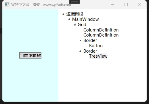
最后,MainWindow的逻辑树就被我们全部显示出来,它与XAML代码保持一致,罗列了前端代码中控件形成的树的样式。
实际上,每个控件因为有Template模板——即每个控件内部也有其构成的元素,换句话说,单看每个控件的组成,其实也是一棵树,只不过,逻辑树并没有将它们显示出来。如果想要在树上不单看到控件组成的树结构,还要看到控件的内部组成结构,那就得用可视化树(VisualTree)。
下一节,我们来介绍VisualTree。
当前课程源码下载:(注明:本站所有源代码请按标题搜索)
文件名:061-《LogicalTree逻辑树》-源代码
链接:https://pan.baidu.com/s/1yu-q4tUtl0poLVgmcMfgBA
提取码:wpff
——重庆教主 2023年9月21日
WPF 中除了逻辑树的概念,还存在可视化树的概念。 可视化树描述由 Visual 基类表示的可视化对象的结构。 为控件编写模板时,将定义或重新定义适用于该控件的可视化树。 对于出于性能和优化考虑需要对绘图进行较低级别控制的开发人员来说,他们也会对可视化树感兴趣。 在传统 WPF 应用程序编程中,可视化树的一个应用是:路由事件的事件路由大多遍历可视化树而非逻辑树。 通过可视化树对事件进行路由可使控件在可视化级别实现组合以处理事件或创建事件资源库。
遍历可视化树需要用到WPF提供的VisualTreeHelper 类,而VisualTreeHelper 类提供 GetChild、GetParent和 GetChildrenCount方法。下面,我们以上一章节的例子来遍历Window窗体的可视化树内容。
前端代码
<Window x:Class="HelloWorld.MainWindow"
        xmlns="http://schemas.microsoft.com/winfx/2006/xaml/presentation"
        xmlns:x="http://schemas.microsoft.com/winfx/2006/xaml"
        xmlns:d="http://schemas.microsoft.com/expression/blend/2008"
        xmlns:mc="http://schemas.openxmlformats.org/markup-compatibility/2006"
        xmlns:local="clr-namespace:HelloWorld"
        xmlns:forms="clr-namespace:System.Windows.Forms;assembly=System.Windows.Forms"
        mc:Ignorable="d" FontSize="14"
        Title="WPF中文网 - 模板 - www.wpfsoft.com" Height="350" Width="500">
    <Grid>
        <Grid.ColumnDefinitions>
            <ColumnDefinition Width="auto"/>
            <ColumnDefinition/>
        </Grid.ColumnDefinitions>
        <Border Grid.Column="0" x:Name="_LeftBorder" Width="188" Background="LightCyan">
            <Button Content="当前可视化树" Click="Button_Click" HorizontalAlignment="Center" VerticalAlignment="Center"/>
        </Border>
        <Border Grid.Column="1" x:Name="_RightBorder" >
            <TreeView x:Name="_TreeView" Margin="5"/>
        </Border>
    </Grid>

</Window>
我们没有修改XAML代码的结构,以便和逻辑树进行对比。
后端代码
 /// <summary>
 /// MainWindow.xaml 的交互逻辑
 /// </summary>
 public partial class MainWindow : Window
 {
     public MainWindow()
     {
         InitializeComponent();

         this.DataContext = new MainViewModel();

     }

     private void Button_Click(object sender, RoutedEventArgs e)
     {
         TreeViewItem item = new TreeViewItem() { Header = "可视化树根" };

         VisualTree(item, this);

         _TreeView.Items.Add(item);
     }

   private void VisualTree(TreeViewItem item, object element)
   {
     if (!(element is DependencyObject)) return;

     TreeViewItem treeViewItem = new TreeViewItem { Header = element.GetType().Name };

     item.Items.Add(treeViewItem);

     for (int i = 0; i < VisualTreeHelper.GetChildrenCount(element as DependencyObject); i++)
     {
         VisualTree(treeViewItem,VisualTreeHelper.GetChild(element as DependencyObject, i));
     }
   }

 }
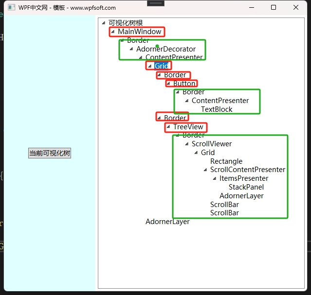
从运行的结果来看,我们会发现它的内容比逻辑树更丰富一些。请注意观察红色框中的内容,它就是前端XAML代码中的控件,而绿色框中的内容是哪来的?其实,这些内容是控件的模板代码——即控件的内部组成。比如从上到下数第一个绿色框中的内容,它就是Window窗体的模板结构,第二个绿框代码则是Button按钮的模板结构,最后一个绿框代码,则是TreeView控件的模板结构。
总结:可视化树 > 逻辑树
理解WPF的逻辑树与可视化树,对于学习WPF的模板、路由事件是十分有帮助的。
当前课程源码下载:(注明:本站所有源代码请按标题搜索)
文件名:062-《VisualTree可视化树》-源代码
链接:https://pan.baidu.com/s/1yu-q4tUtl0poLVgmcMfgBA
提取码:wpff
一、控件模板概述
在前面的章节中,我们介绍了逻辑树和可视化树,界面通常由多个控件构成,多个控件会构成一个树,这棵树就是逻辑树,逻辑树指界面上所有控件的组织关系;而每个控件内部也有一定的组织关系(可视化树),这个组织关系定义了控件的结构和外观。WPF为每个控件的定义了一个默认的结构外观,也就是默认的控件模板。
在进一步学习控件模板之前,我们先了解一下模板与样式的区别。
比如一个人的肤色、臂长、身高、五官等,这个可以通过样式设定,所以大街上我们可以看到形形色色的人,有的是白种人,有的是黄种人,有的身高1米5,有的身高2米,有的五官好看,有的不好看。但是这些人都有皮肤、两只手、两只眼睛等等。这是因为他们的模板都是相同的。
咦?那有的人生下来就只有一只手,或者一只眼,这做何解释?这就是因为他的模板与大多数人不一样。
我们再以WPF中的Button为例。默认情况下,Button按钮的内容只能显示文字,我们可以设置它的Content属性即可。也可以设置它的Width和Height,改变它的尺寸,但是,它始终是一个矩形的按钮。假如我们希望得到一个圆形的按钮、或者带图标的按钮,这个时候就需要去改变按钮的内部结构外观——ControlTemplate控件模板。
FrameworkElement基类有一个Template属性就是指控件的ControlTemplate模板,这就意味着,几乎所有的WPF控件都是可以修改它的结构和外观(可视化树)的。注意,不能仅替换控件的可视化树的一部分;若要更改控件的可视化树,必须将该控件的 Template 属性设置为新的完整 ControlTemplate。
二、查看控件的默认模板
下面的操作演示了如何查看控件的默认模板。
比如我们有一个Button按钮,在设计界面中用鼠标单击右键-编辑模板-编辑副本。
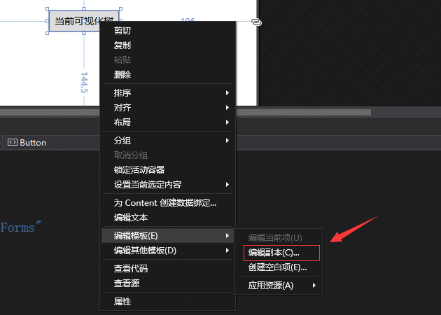
此时,会弹出一个对话框,如下所示。名称表示定义当前按钮的样式key的名称,定义位置默认在此文档中,于是会生成当前按钮的默认样式。我们可以从当前按钮的默认样式中找到它内部的可视化树——控件模板。
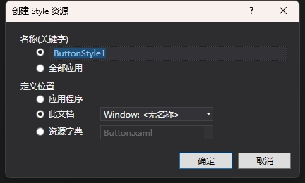
这些模板样式代码会生成到Window.Resources中。代码如下
    <Window.Resources>
        <Style x:Key="FocusVisual">
            <Setter Property="Control.Template">
                <Setter.Value>
                    <ControlTemplate>
                        <Rectangle Margin="2" SnapsToDevicePixels="true" Stroke="{DynamicResource {x:Static SystemColors.ControlTextBrushKey}}" StrokeThickness="1" StrokeDashArray="1 2"/>
                    </ControlTemplate>
                </Setter.Value>
            </Setter>
        </Style>
        <SolidColorBrush x:Key="Button.Static.Background" Color="#FFDDDDDD"/>
        <SolidColorBrush x:Key="Button.Static.Border" Color="#FF707070"/>
        <SolidColorBrush x:Key="Button.MouseOver.Background" Color="#FFBEE6FD"/>
        <SolidColorBrush x:Key="Button.MouseOver.Border" Color="#FF3C7FB1"/>
        <SolidColorBrush x:Key="Button.Pressed.Background" Color="#FFC4E5F6"/>
        <SolidColorBrush x:Key="Button.Pressed.Border" Color="#FF2C628B"/>
        <SolidColorBrush x:Key="Button.Disabled.Background" Color="#FFF4F4F4"/>
        <SolidColorBrush x:Key="Button.Disabled.Border" Color="#FFADB2B5"/>
        <SolidColorBrush x:Key="Button.Disabled.Foreground" Color="#FF838383"/>
        <Style x:Key="ButtonStyle1" TargetType="{x:Type Button}">
            <Setter Property="FocusVisualStyle" Value="{StaticResource FocusVisual}"/>
            <Setter Property="Background" Value="{StaticResource Button.Static.Background}"/>
            <Setter Property="BorderBrush" Value="{StaticResource Button.Static.Border}"/>
            <Setter Property="Foreground" Value="{DynamicResource {x:Static SystemColors.ControlTextBrushKey}}"/>
            <Setter Property="BorderThickness" Value="1"/>
            <Setter Property="HorizontalContentAlignment" Value="Center"/>
            <Setter Property="VerticalContentAlignment" Value="Center"/>
            <Setter Property="Padding" Value="1"/>
            <Setter Property="Template">
                <Setter.Value>
                    <ControlTemplate TargetType="{x:Type Button}">
                        <Border x:Name="border" BorderBrush="{TemplateBinding BorderBrush}" BorderThickness="{TemplateBinding BorderThickness}" Background="{TemplateBinding Background}" SnapsToDevicePixels="true">
                            <ContentPresenter x:Name="contentPresenter" Focusable="False" HorizontalAlignment="{TemplateBinding HorizontalContentAlignment}" Margin="{TemplateBinding Padding}" RecognizesAccessKey="True" SnapsToDevicePixels="{TemplateBinding SnapsToDevicePixels}" VerticalAlignment="{TemplateBinding VerticalContentAlignment}"/>
                        </Border>
                        <ControlTemplate.Triggers>
                            <Trigger Property="IsDefaulted" Value="true">
                                <Setter Property="BorderBrush" TargetName="border" Value="{DynamicResource {x:Static SystemColors.HighlightBrushKey}}"/>
                            </Trigger>
                            <Trigger Property="IsMouseOver" Value="true">
                                <Setter Property="Background" TargetName="border" Value="{StaticResource Button.MouseOver.Background}"/>
                                <Setter Property="BorderBrush" TargetName="border" Value="{StaticResource Button.MouseOver.Border}"/>
                            </Trigger>
                            <Trigger Property="IsPressed" Value="true">
                                <Setter Property="Background" TargetName="border" Value="{StaticResource Button.Pressed.Background}"/>
                                <Setter Property="BorderBrush" TargetName="border" Value="{StaticResource Button.Pressed.Border}"/>
                            </Trigger>
                            <Trigger Property="IsEnabled" Value="false">
                                <Setter Property="Background" TargetName="border" Value="{StaticResource Button.Disabled.Background}"/>
                                <Setter Property="BorderBrush" TargetName="border" Value="{StaticResource Button.Disabled.Border}"/>
                                <Setter Property="TextElement.Foreground" TargetName="contentPresenter" Value="{StaticResource Button.Disabled.Foreground}"/>
                            </Trigger>
                        </ControlTemplate.Triggers>
                    </ControlTemplate>
                </Setter.Value>
            </Setter>
        </Style>
    </Window.Resources>
在前面的章节中,我们已了解过样式的写法,在这里,我们关注一下Setter项目设置Template属性的写法,因为Template属性是ContorlTemplate类型,所以在上面的代码中实例化了一个ControlTemplate对象,并且,TargetType="{x:Type Button}",表示这个ContorlTemplate实例是给Button定义的模板。
而在ContorlTemplate对象中,定义了一棵可视化树。
<Border x:Name="border"
        BorderBrush="{TemplateBinding BorderBrush}"
        BorderThickness="{TemplateBinding BorderThickness}"
        Background="{TemplateBinding Background}"
        SnapsToDevicePixels="true">
    <ContentPresenter x:Name="contentPresenter"
                      Focusable="False"
                      HorizontalAlignment="{TemplateBinding HorizontalContentAlignment}"
                      Margin="{TemplateBinding Padding}"
                      RecognizesAccessKey="True"
                      SnapsToDevicePixels="{TemplateBinding SnapsToDevicePixels}"
                      VerticalAlignment="{TemplateBinding VerticalContentAlignment}"/>
</Border>
这里定义了一个Border装修器,里面有一个ContentPresenter对象。什么是ContentPresenter对象?
三、什么是ContentPresenter对象?
ContentPresenter继承于FrameworkElement,说明它也是一个控件。从命名上看,它叫内容主持者,本质上它只是一个占座的,为谁占座?为ContentControl内容控件占座。因为Button继承于ContentControl,所以Button也有Content属性,在ContentTemplate中的ContentPresenter可视为等于Content属性。
友情提示
ContentPresenter 定义边框属性,使你无需使用其他 Border 元素即可在 ContentPresenter 周围绘制 边框 。 属性为 ContentPresenter.BorderBrush、 ContentPresenter.BorderThickness、 ContentPresenter.CornerRadius 和 ContentPresenter.Padding。
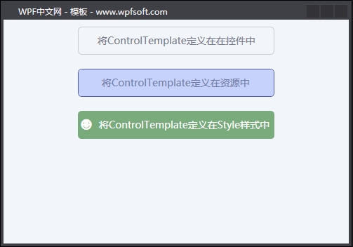
四、控件模板的几种设置方式
4.1将ControlTemplate定义在在控件中
<Button Content="将ControlTemplate定义在在控件中"
        Width="280" Height="40" Margin="10" Foreground="#747787">
    <Button.Template>
        <ControlTemplate TargetType="Button">
            <Border Background="Transparent" CornerRadius="5" BorderThickness="1" BorderBrush="#C9CCD5">
                <ContentPresenter  HorizontalAlignment="Center" VerticalAlignment="Center"/>
            </Border>
        </ControlTemplate>
    </Button.Template>
</Button>
4.2将ControlTemplate定义在资源中
<Window.Resources>
    <ControlTemplate x:Key="ButtonTemplate" TargetType="Button">
        <Border Background="#C6D2FC" CornerRadius="5" BorderThickness="1" BorderBrush="#545BAD">
            <ContentPresenter  HorizontalAlignment="Center" VerticalAlignment="Center"/>
        </Border>
    </ControlTemplate>
</Window.Resources>

<Button Content="将ControlTemplate定义在资源中"
        Template="{StaticResource ButtonTemplate}"
        Width="280" Height="40" Margin="10" Foreground="#707CA5"/>
4.3将ControlTemplate定义在Style样式中
<Button Content="将ControlTemplate定义在Style样式中"
        Width="280" Height="40" Margin="10" Foreground="White">
    <Button.Style>
        <Style TargetType="Button">
            <Setter Property="Template">
                <Setter.Value>
                    <ControlTemplate TargetType="Button">
                        <Border Background="#7AAB7D" CornerRadius="5">
                            <Grid>
                                <Grid.ColumnDefinitions>
                                    <ColumnDefinition Width="auto"/>
                                    <ColumnDefinition/>
                                </Grid.ColumnDefinitions>
                                <TextBlock Grid.Column="0" Text="☻"
                                           VerticalAlignment="Center"
                                           Margin="3" FontSize="18"/>
                                <ContentPresenter Grid.Column="1"
                                                  HorizontalAlignment="Center"
                                                  VerticalAlignment="Center"/>
                            </Grid>
                        </Border>
                    </ControlTemplate>
                </Setter.Value>
            </Setter>
        </Style>
    </Button.Style>
</Button>
上面三种方式,都可以去定义控件的ContentTemplate,不同的定义方式,可见度不一样而已。比如第一种定义方式,只能是当前那个控件私有,第二种定义方式,它就是一个公有的模板实例。
当前课程源码下载:(注明:本站所有源代码请按标题搜索)
文件名:063-《ControlTemplate控件模板》-源代码
链接:https://pan.baidu.com/s/1yu-q4tUtl0poLVgmcMfgBA
提取码:wpff
——重庆教主 2023年9月28日
我们来观察一下ControlTemplate控件模块的定义
public class ControlTemplate : FrameworkTemplate
{
    public ControlTemplate();
    public ControlTemplate(Type targetType);

    public Type TargetType { get; set; }
    public TriggerCollection Triggers { get; }

    protected override void ValidateTemplatedParent(FrameworkElement templatedParent);

}
可以看到在ControlTemplate中定义了一个Triggers 集合,说明可以定义一些触发器,以实现控件的交互效果。我们之前在《样式》章节中学过几种触发器,在这里用例子演示一下ControlTemplate的触发器的用法。
我们将上一章节的例子进行一些微调,因为在使用触发器时,有些细节需要注意。
一、在控件中的ControlTemplate的触发器
<Button Content="将ControlTemplate定义在在控件中"
        Width="280"
        Height="40"
        Margin="10"
        Foreground="#747787">
    <Button.Template>
        <ControlTemplate TargetType="Button">
            <Border x:Name="border"
                    Background="Transparent"
                    CornerRadius="5"
                    BorderThickness="1"
                    BorderBrush="#C9CCD5">
                <ContentPresenter x:Name="contentPresenter"
                                  HorizontalAlignment="Center"
                                  VerticalAlignment="Center"/>
            </Border>
            <ControlTemplate.Triggers>
                <Trigger Property="IsMouseOver" Value="True">
                    <Setter Property="Content" Value="MouseOver" TargetName="contentPresenter"/>
                </Trigger>
                <Trigger Property="IsMouseOver" Value="False">
                    <Setter Property="Content" Value="将ControlTemplate定义在在控件中" TargetName="contentPresenter"/>
                </Trigger>
            </ControlTemplate.Triggers>
        </ControlTemplate>
    </Button.Template>
</Button>
在上面的例子中,我们在Triggers集合中增加了两个Trigger 对象,条件是当鼠标移上去或鼠标移开的时候,更改了Button的Content属性。
二、在Resources定义的ControlTemplate的触发器
<Window.Resources>
    <ControlTemplate x:Key="ButtonTemplate" TargetType="Button">
        <Border Background="#C6D2FC"
                CornerRadius="5"
                BorderThickness="1"
                BorderBrush="#545BAD">
            <ContentPresenter  HorizontalAlignment="Center"
                               VerticalAlignment="Center"/>
        </Border>
        <ControlTemplate.Triggers>
            <Trigger Property="IsMouseOver" Value="True">
                <Setter Property="Width" Value="300"/>
            </Trigger>
            <Trigger Property="IsMouseOver" Value="False">
                <Setter Property="Width" Value="280"/>
            </Trigger>
        </ControlTemplate.Triggers>
    </ControlTemplate>
</Window.Resources>

<Button Content="将ControlTemplate定义在资源中"
        Template="{StaticResource ButtonTemplate}"
        Height="40" Margin="10" Foreground="#707CA5"/>
上面演示了定义在资源中的控件模板的触发器,需要注意的一点是,我们在触发器执行时更改了Button的宽度,这个时候,要把Button原先设置的Width删除,因为”就近原则“,直接设置控件的属性值大于天,而在模板中设置控件的属性值的权重要小一些。
三、Style样式中的ConControlTemplate的触发器
<Button Content="将ControlTemplate定义在Style样式中"
        Width="280" Height="40" Margin="10" >
    <Button.Style>
        <Style TargetType="Button">
            <Setter Property="Template">
                <Setter.Value>
                    <ControlTemplate TargetType="Button">
                        <Border x:Name="border"
                                CornerRadius="5"
                                BorderThickness="1"
                                BorderBrush="#7AAB7D">
                            <Grid>
                                <Grid.ColumnDefinitions>
                                    <ColumnDefinition Width="auto"/>
                                    <ColumnDefinition/>
                                </Grid.ColumnDefinitions>
                                <TextBlock Grid.Column="0" Text="☻"
                                           VerticalAlignment="Center"
                                           Margin="3" FontSize="18"/>
                                <ContentPresenter Grid.Column="1"
                                                  HorizontalAlignment="Center"
                                                  VerticalAlignment="Center"/>
                            </Grid>
                        </Border>
                        <ControlTemplate.Triggers>
                            <Trigger Property="IsMouseOver" Value="True">
                                <Setter Property="Foreground" Value="#7AAB7D"/>
                                <Setter Property="Background" Value="White" TargetName="border"/>
                            </Trigger>
                            <Trigger Property="IsMouseOver" Value="False">
                                <Setter Property="Foreground" Value="White"/>
                                <Setter Property="Background" Value="#7AAB7D" TargetName="border"/>
                            </Trigger>
                        </ControlTemplate.Triggers>
                    </ControlTemplate>
                </Setter.Value>
            </Setter>
        </Style>
    </Button.Style>
</Button>
ControlTemplate中使用触发器,还有一个好处是:可以指定设置某个可视化树中的控件对象。比如上面这段代码,当鼠标移上去的时候,我们修改了border对象的背景色,这个背景色其实并不是Button本身的背景颜色,而是Button内部可视化树中的Border的背景颜色。只需要利用Setter的TargetName属性来指定就行了。
而鼠标移上去的时候,我们还修改了Foreground前景颜色,这个Foreground才是Button本身的属性。说明什么问题?说明ControlTemplate中的触发器不但可以修改控件的属性,还可以修改控件模板中的可视化树的元素的属性,它真是太好用了。
我们来看一下运行结果。
要充分了解ControlTemplate控件模板的定义和触发器的使用,还离不开TemplateBinding(模板绑定),它将控件的属性和控件的可视化树元素的属性建立绑定关系,在设计控件模板时,可以更好的设计出控件的结构、外观和交互效果。
当前课程源码下载:(注明:本站所有源代码请按标题搜索)
文件名:064-《ControlTemplate的触发器》-源代码
链接:https://pan.baidu.com/s/1yu-q4tUtl0poLVgmcMfgBA
提取码:wpff
——重庆教主 2023年9月28日
TemplateBinding和Binding在使用上类似,但是从它的定义上看,它的Property属性是要求传入一个DependencyProperty依赖属性。
public class TemplateBindingExtension : MarkupExtension
{
    public TemplateBindingExtension();
    public TemplateBindingExtension(DependencyProperty property);

    public DependencyProperty Property { get; set; }
    public IValueConverter Converter { get; set; }
    public object ConverterParameter { get; set; }

    public override object ProvideValue(IServiceProvider serviceProvider);

}
控件的大多数属性都是DependencyProperty类型,所以我们就可以在定制控件的可视化树(控件模板)时,将控件的属性通过TemplateBinding绑定到模板里面的元素的属性上。
我们将前面的例子做一些调整。首先定义一个Person实体类和MainViewModel
public class ObservableObject : INotifyPropertyChanged
{
    public event PropertyChangedEventHandler PropertyChanged;

    public void RaisePropertyChanged([CallerMemberName] string propertyName = "")
    {
        PropertyChanged?.Invoke(this, new PropertyChangedEventArgs(propertyName));
    }
}
public class Person : ObservableObject
{
    private string name;
    public string Name
    {
        get { return name; }
        set { name = value;RaisePropertyChanged(); }
    }

    private string occupation;
    public string Occupation
    {
        get { return occupation; }
        set { occupation = value; RaisePropertyChanged(); }
    }

    private int age;
    public int Age
    {
        get { return age; }
        set { age = value; RaisePropertyChanged(); }
    }

    private int money;
    public int Money
    {
        get { return money; }
        set { money = value; RaisePropertyChanged(); }
    }

    private string address;
    public string Address
    {
        get { return address; }
        set { address = value; RaisePropertyChanged(); }
    }
}
MainViewModel
public class MainViewModel : ObservableObject
{
    private Person person;
    public Person Person
    {
        get { return person; }
        set { person = value; RaisePropertyChanged(); }
    }
    public MainViewModel()
    {
        person = new Person()
        {
            Name = "Michael Jackson",
            Occupation = "Musicians",
            Age = 25,
            Money = 9999999,
            Address = "深圳市光明区智慧招商城B4栋5楼"
        };
    }
}
然后,我们在Window的Resource中定义一个Button的样式
<Style x:Key="CardButtonStyle" TargetType="Button">
<Setter Property="Background" Value="#E7EAF4"/>
<Setter Property="Foreground" Value="#20232E"/>
<Setter Property="Template">
<Setter.Value>
<ControlTemplate TargetType="Button">
<Border x:Name="border"
Width="{TemplateBinding Width}"
Height="{TemplateBinding Height}"
Background="{TemplateBinding Background}"
BorderThickness="1"
BorderBrush="Gray">
<Border.ToolTip>
<ContentPresenter/>
</Border.ToolTip>
<Grid>
<Grid.RowDefinitions>
<RowDefinition/>
<RowDefinition/>
</Grid.RowDefinitions>
<StackPanel Grid.Row="0" Margin="20">
<TextBlock Text="{Binding Name}"
Foreground="{TemplateBinding Foreground}"
FontWeight="Bold" FontSize="20"/>
<Rectangle Height="5"/>
<TextBlock Text="{Binding Occupation}"
Foreground="{TemplateBinding Foreground}"
FontSize="16"/>
</StackPanel>
<StackPanel Grid.Row="1" Orientation="Horizontal">
<TextBlock Grid.Column="0" Text="☻"
VerticalAlignment="Center" Margin="20"
FontSize="50" Foreground="#E26441"/>
<StackPanel Margin="30 0 0 0" Width="150">
<TextBlock Text="COMPANY NAME"/>
<TextBlock Text="Age:">
<Run Text="{Binding Age}"/>
</TextBlock>
<TextBlock Text="Money:">
<Run Text="{Binding Money, StringFormat={}{0:C}}"/>
</TextBlock>
<TextBlock Text="Address:" TextWrapping="Wrap">
<Run Text="{Binding Address}"/>
</TextBlock>
</StackPanel>
</StackPanel>
</Grid>
</Border>
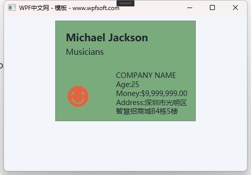
<ControlTemplate.Triggers>
<Trigger Property="IsMouseOver" Value="True">
<Setter Property="Background" Value="#7AAB7D" />
</Trigger>
</ControlTemplate.Triggers>
</ControlTemplate>
</Setter.Value>
</Setter>
</Style>
在这个样式中,我们定义了一个ControlTemplate控件模板,而控件模板的可视化树稍微有点复杂。首先在最外层定义了一个Border对象,并通过TemplateBinding绑定了Width、Height和Background,这三个属性哪来的?就是Button的Width、Height和Background。ContentPresenter对象则放到了Border的ToolTip属性中。
然后,我们在Border中实例化了一个Grid对象,并在里面放了一些StackPanel和TextBlock,需要注意的是,TextBlock的Text采用了Binding对象,分别绑定了一些属性。这些绑定的数据源其实是从Button的DataContext中获得的。所以我们如果要顺利地使用这个样式,则在使用时,一定要给Button的DataContext属性赋值一个数据源。这个数据源就是Person实体。
前端使用样式的代码
<Button Content="将ControlTemplate定义在Style样式中"
        Width="280" Height="200" Margin="10"
        Click="Button_Click"
        Style="{StaticResource CardButtonStyle}"
        DataContext="{Binding Person}">
</Button>
如上所示,我们给Button的DataContext绑定了一个Person数据源,这个Person会在Button的可视化树中被引用,从而得到我们想要的效果。
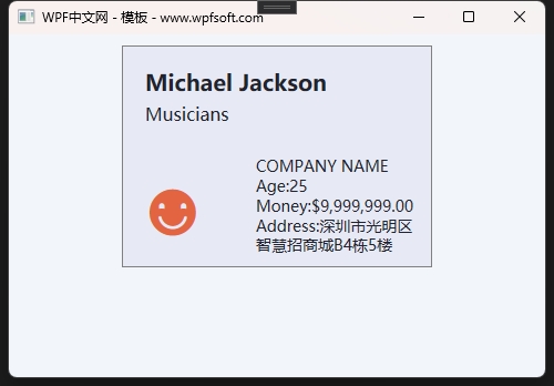
当鼠标移上去时,还会触发ControlTemplate的触发器,实现背景颜色的变化。
从效果图上看,它像是一个复杂的布局,或者一个UserControl。其实它就是一个Button,只不过,我们通过样式、模板、触发器、绑定等手段,实现了这一效果。
当前课程源码下载:(注明:本站所有源代码请按标题搜索)
文件名:065-《TemplateBinding模板绑定》-源代码
链接:https://pan.baidu.com/s/1yu-q4tUtl0poLVgmcMfgBA
提取码:wpff
——重庆教主 2023年9月28日
什么是数据模板?其实就是数据的表现形式——数据外衣。
public class DataTemplate : FrameworkTemplate
{
    public DataTemplate();
    public DataTemplate(object dataType);

    public object DataType { get; set; }
    public TriggerCollection Triggers { get; }
    public object DataTemplateKey { get; }

    protected override void ValidateTemplatedParent(FrameworkElement templatedParent);

}
DataTemplate 继承于FrameworkTemplate基类,它有3个属性,分别是DataType 、Triggers 和DataTemplateKey 。DataType表示当前数据模板所针对的数据类型,Triggers 是触发器集合。
在ItemsControl集合控件中就有一个ItemTemplate属性,它的类型就是DataTemplate 。说明所有继承于ItemsControl的集合子控件都可以设置数据模板。
接下来,我们以ItemsControl控件为例,演示其数据模块的使用方法。
我们将上一章节的例子稍做修改,首先是MainViewModel,新建一个Person的集合作为ItemsControl控件的数据源。
public class MainViewModel : ObservableObject
{
    private List<Person> persons = new List<Person>();
    public List<Person> Persons
    {
        get { return persons; }
        set { persons = value;RaisePropertyChanged(); }
    }

    private Person person;
    public Person Person
    {
        get { return person; }
        set { person = value; RaisePropertyChanged(); }
    }
    public MainViewModel()
    {
        person = new Person()
        {
            Name = "Michael Jackson",
            Occupation = "Musicians",
            Age = 25,
            Money = 9999999,
            Address = "深圳市光明区智慧招商城B4栋5楼"
        };

        var bill = new Person()
        {
            Name = "比尔·盖茨(Bill Gates)",
            Occupation = "微软公司创始人",
            Age = 61,
            Money = 9999999,
            Address = "美国华盛顿州西雅图"
        };

        var musk = new Person()
        {
            Name = "Elon Reeve Musk",
            Occupation = "首席执行官",
            Age = 50,
            Money = 365214580,
            Address = "出生于南非的行政首都比勒陀利亚"
        };

        var jeff = new Person()
        {
            Name = "杰夫·贝索斯(Jeff Bezos)",
            Occupation = "董事会执行主席",
            Age = 25,
            Money = 85745845,
            Address = "杰夫·贝索斯出生于美国新墨西哥州阿尔布奎克。"
        };

        persons.Add(person);
        persons.Add(bill);
        persons.Add(musk);
        persons.Add(jeff);
    }
}
然后在XAML前端代码中实例化一个ItemsControl控件,并将其包含在ScrollViewer之中。
<Grid>
<ScrollViewer>
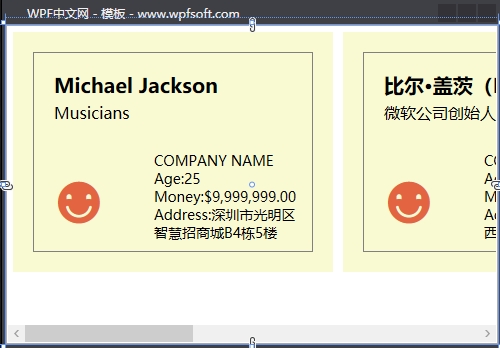
<ItemsControl ItemsSource="{Binding Persons}">
<ItemsControl.ItemTemplate>
<DataTemplate>
<Border x:Name="border"
Width="280"
Height="200"
Margin="5"
BorderThickness="1"
BorderBrush="Gray">
<Grid>
<Grid.RowDefinitions>
<RowDefinition/>
<RowDefinition/>
</Grid.RowDefinitions>
<StackPanel Grid.Row="0" Margin="20">
<TextBlock Text="{Binding Name}" FontWeight="Bold" FontSize="20"/>
<Rectangle Height="5"/>
<TextBlock Text="{Binding Occupation}" FontSize="16"/>
</StackPanel>
<StackPanel Grid.Row="1" Orientation="Horizontal">
<TextBlock Grid.Column="0" Text="☻"
VerticalAlignment="Center" Margin="20"
FontSize="50" Foreground="#E26441"/>
<StackPanel Margin="30 0 0 0" Width="150">
<TextBlock Text="COMPANY NAME"/>
<TextBlock Text="Age:">
<Run Text="{Binding Age}"/>
</TextBlock>
<TextBlock Text="Money:">
<Run Text="{Binding Money, StringFormat={}{0:C}}"/>
</TextBlock>
<TextBlock Text="Address:" TextWrapping="Wrap">
<Run Text="{Binding Address}"/>
</TextBlock>
</StackPanel>
</StackPanel>
</Grid>
</Border>
<DataTemplate.Triggers>
<Trigger Property="IsMouseOver" Value="True">
<Setter Property="Background" Value="#7AAB7D" TargetName="border" />
</Trigger>
</DataTemplate.Triggers>
</DataTemplate>
</ItemsControl.ItemTemplate>
</ItemsControl>
</ScrollViewer>
</Grid>
注意:ScrollViewer外面不能是StackPanel,所以这里改成Grid之后,ItemsControl的滚动条效果才会起效。起初我们没有设置ItemsControl 的ItemTemplate(数据模板),只是绑定了数据源,此时它的效果是下面这样子的。
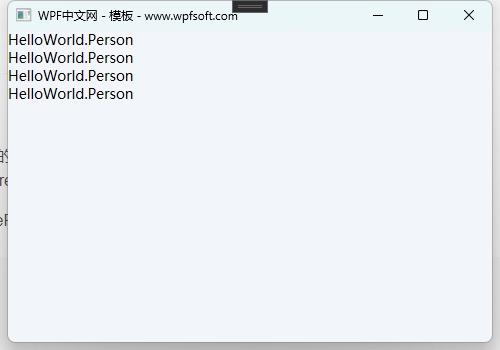
然后,我们给ItemTemplate属性实例化了一个DataTemplate,其视觉树的样式参考前一节内容。它的效果如下
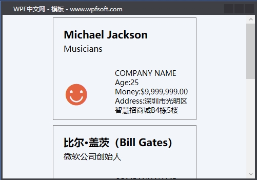
由此可见,ItemsControl的元素默认是垂直排列的,因为用于指定元素排列的默认布局控件是StackPanel。如果我们希望改变元素的排列布局方向,则需要修改ItemsControl控件的ItemsPanel属性——即ItemsPanelTemplate元素布局模板。
当前课程源码下载:(注明:本站所有源代码请按标题搜索)
文件名:066-《DataTemplate数据模板》-源代码
链接:https://pan.baidu.com/s/1yu-q4tUtl0poLVgmcMfgBA
提取码:wpff
——重庆教主 2023年10月7日
ItemsPanelTemplate用于指定集合控件中元素与元素之间的布局的方式,所以,ItemsPanelTemplate其实就是一个布局面板,而我们在前面的章节中已经学习了WPF的面板控件,它们都继承于Panel基类,分别是Grid、UniformGrid、StackPanel、WrapPanel、DockPanel、Canvas等。而在使用ItemsPanelTemplate模板去设置某一个集合控件的元素布局面板时,默认使用StackPanel布局,或者WrapPanel。
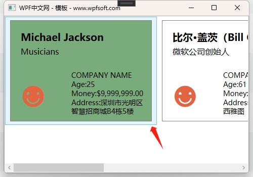
例如在上一章节的ItemsControl控件中,我们有4个元素,它们都是垂直排列的。我们可以修改ItemsPanel属性,用以设置元素以瀑布流的方式排列显示。
<ItemsControl.ItemsPanel>
    <ItemsPanelTemplate>
        <WrapPanel/>
    </ItemsPanelTemplate>
</ItemsControl.ItemsPanel>

如上图所示,此时ItemsControl中的元素便随着Window窗体大小的改变,而自适应水平排列其中的元素。
当前课程源码下载:(注明:本站所有源代码请按标题搜索)
文件名:067-《ItemsPanelTemplate元素面板模板》-源代码
链接:https://pan.baidu.com/s/1yu-q4tUtl0poLVgmcMfgBA
提取码:wpff
——重庆教主 2023年10月7日
众所周知,ListBox继承于ItemsControl控件,那么,它就与ItemsControl一样,拥有了可以设置的数据模板。当然,它也可以拥有自己的控件模板(在Control基类中定义的Template)。这一节,我们只探讨一下ListBox如何使用数据模板。
我们可以将上一章节中的ItemsControl直接改成ListBox。
<ListBox ItemsSource="{Binding Persons}" >
    <ItemsControl.ItemsPanel>
        <ItemsPanelTemplate>
            <WrapPanel/>
        </ItemsPanelTemplate>
    </ItemsControl.ItemsPanel>
    <ItemsControl.ItemTemplate>
        <DataTemplate>
            <Border x:Name="border"
                    Width="280"
                    Height="200"
                    Margin="5"
                    BorderThickness="1"
                    BorderBrush="Gray">
                <Grid>
                    <Grid.RowDefinitions>
                        <RowDefinition/>
                        <RowDefinition/>
                    </Grid.RowDefinitions>
                    <StackPanel Grid.Row="0" Margin="20">
                        <TextBlock Text="{Binding Name}" FontWeight="Bold" FontSize="20"/>
                        <Rectangle Height="5"/>
                        <TextBlock Text="{Binding Occupation}" FontSize="16"/>
                    </StackPanel>
                    <StackPanel Grid.Row="1" Orientation="Horizontal">
                        <TextBlock Grid.Column="0" Text="☻"
                                       VerticalAlignment="Center"  Margin="20"
                                       FontSize="50" Foreground="#E26441"/>
                        <StackPanel Margin="30 0 0 0" Width="150">
                            <TextBlock Text="COMPANY NAME"/>
                            <TextBlock Text="Age:">
                                    <Run Text="{Binding Age}"/>
                            </TextBlock>
                            <TextBlock Text="Money:">
                                    <Run Text="{Binding Money, StringFormat={}{0:C}}"/>
                            </TextBlock>
                            <TextBlock Text="Address:" TextWrapping="Wrap">
                                    <Run Text="{Binding Address}"/>
                            </TextBlock>
                        </StackPanel>
                    </StackPanel>
                </Grid>
            </Border>
            <DataTemplate.Triggers>
                <Trigger Property="IsMouseOver" Value="True">
                    <Setter Property="Background" Value="#7AAB7D" TargetName="border" />
                </Trigger>
            </DataTemplate.Triggers>
        </DataTemplate>
    </ItemsControl.ItemTemplate>
</ListBox>
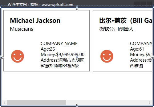
因为ListBox是ItemsControl的子类,所以,这样的修改是没有问题的。只不过,如上图所示,在每个元素的外围,当鼠标移上去时,会出现一个淡蓝色的边框区域,这是为何呢?
这是因为在ListBox的父类ItemsControl中定义了一个ItemContainerStyle的样式,这个样式决定了ListBox控件中每个元素的容器外观。原来,在集合控件中,并不是说将一堆元素直接丢到里面呈现,而是先给每个元素分配一个容器,再将它们呈现在集合控件中。就好比给每个学生发一套校服,穿好后再规规距距地坐在教室里。
既然如此,那我们就可以给每个学生重新发一套校服,或者干脆不穿校服——毕竟每个学生自己都穿了衣服的(数据模板)。
<ListBox.ItemContainerStyle>
    <Style TargetType="ListBoxItem">
        <Setter Property="Template">
            <Setter.Value>
                <ControlTemplate TargetType="ListBoxItem">
                    <ContentPresenter/>
                </ControlTemplate>
            </Setter.Value>
        </Setter>
    </Style>
</ListBox.ItemContainerStyle>
ItemContainerStyle的Template的内容必须是ControlTemplate (控件模板)。这里同样使用了ContentPresenter,我们已然在前面讲过,这里指的是,将来由每个元素进行替换。注意TargetType是ListBoxItem类型。因为这个校服的品牌方就是指ListBox的ListBoxItem元素。
如果我们要给每个学生穿一件金黄色的衣服,如下所示
<ListBox.ItemContainerStyle>
    <Style TargetType="ListBoxItem">
        <Setter Property="Template">
            <Setter.Value>
                <ControlTemplate TargetType="ListBoxItem">
                    <Border Background="LightGoldenrodYellow"
                            Padding="15" Margin="5">
                        <ContentPresenter/>
                    </Border>
                </ControlTemplate>
            </Setter.Value>
        </Setter>
    </Style>
</ListBox.ItemContainerStyle>
当前课程源码下载:(注明:本站所有源代码请按标题搜索)
文件名:068-《ListBox的ItemContainerStyle》-源代码
链接:https://pan.baidu.com/s/1yu-q4tUtl0poLVgmcMfgBA
提取码:wpff
通过前面的模板样式相关知识的学习,接下来,我们选几个具有代表性的控件进行实战演练,以便灵活掌握WPF的模板和样式的应用。
第一步,创建一个数据实体
public class Sentence : ObservableObject
{
    private string content;
    public string Content
    {
        get { return content; }
        set { content = value; RaisePropertyChanged(); }
    }
}
第二步,将数据实体放到ViewModel中
public class MainViewModel : ObservableObject
{

    private ObservableCollection<Sentence> poetries = new ObservableCollection<Sentence>();
    public ObservableCollection<Sentence> Poetries
    {
        get { return poetries; }
        set { poetries = value; RaisePropertyChanged(); }
    }

    public MainViewModel()
    {
        Poetries.Add(new Sentence() { Content = "汉皇重色思倾国,御宇多年求不得。" });
        Poetries.Add(new Sentence() { Content = "杨家有女初长成,养在深闺人未识。" });
        Poetries.Add(new Sentence() { Content = "天生丽质难自弃,一朝选在君王侧。" });
        Poetries.Add(new Sentence() { Content = "回眸一笑百媚生,六宫粉黛无颜色。" });
        Poetries.Add(new Sentence() { Content = "春寒赐浴华清池,温泉水滑洗凝脂。" });
        Poetries.Add(new Sentence() { Content = "侍儿扶起娇无力,始是新承恩泽时。" });
        Poetries.Add(new Sentence() { Content = "云鬓花颜金步摇,芙蓉帐暖度春宵。" });
    }
}
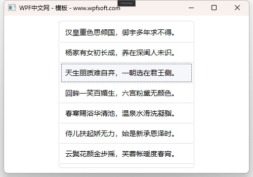
第三步,在XAML代码中实例化一个ListBox,并修改它的数据模板、样式和元素布局模板。
 <Grid>
     <Border Width="268"
             BorderBrush="#DFDFDF"
             BorderThickness="1"
             CornerRadius="5"
             Margin="10">
         <ListBox ItemsSource="{Binding Poetries}" >
             <ListBox.ItemTemplate>
                 <DataTemplate>
                     <Border>
                         <TextBlock Text="{Binding Content}"
                                    FontSize="14"
                                    Margin="10 5 10 5"/>
                     </Border>
                 </DataTemplate>
             </ListBox.ItemTemplate>
             <ListBox.Style>
                 <Style TargetType="ListBox">
                     <Setter Property="Focusable" Value="False"/>
                     <Setter Property="Padding" Value="0"/>
                     <Setter Property="Margin" Value="0"/>
                     <Setter Property="Background" Value="Transparent"/>
                     <Setter Property="BorderBrush" Value="Transparent"/>
                     <Setter Property="ItemContainerStyle">
                         <Setter.Value>
                             <Style TargetType="ListBoxItem">
                                 <Setter Property="Height" Value="40"/>
                                 <Setter Property="Template">
                                     <Setter.Value>
                                         <ControlTemplate TargetType="ListBoxItem">
                                             <Border Height="{TemplateBinding Height}"
                                                     BorderThickness="0 0 0 1"
                                                     BorderBrush="#DFDFDF"
                                                     Background="{TemplateBinding Background}">
                                                 <ContentPresenter VerticalAlignment="Center"/>
                                             </Border>
                                         </ControlTemplate>
                                     </Setter.Value>
                                 </Setter>
                                 <Style.Triggers>
                                     <Trigger Property="IsMouseOver" Value="True">
                                         <Setter Property="Background" Value="#F5F7FA"/>
                                     </Trigger>
                                     <Trigger Property="IsSelected" Value="True">
                                         <Setter Property="Background" Value="#F5F7FA"/>
                                     </Trigger>
                                 </Style.Triggers>
                             </Style>
                         </Setter.Value>
                     </Setter>
                 </Style>
             </ListBox.Style>
         </ListBox>
     </Border>
 </Grid>
在ListBoxItem中有一个IsSelected属性,表示当前项是否被选中。ListBoxItem作为ListBox的元素子项而存在,所以我们在ListBox列表控件中选中某一个项时,实际上是将当前项的IsSelected值为True。于是,就可以利用这个属性做一个触发器,当ListBoxItem被选中时,修改其背景颜色。
当前课程源码下载:(注明:本站所有源代码请按标题搜索)
文件名:069-《ListBox模板样式实战》-源代码
链接:https://pan.baidu.com/s/1yu-q4tUtl0poLVgmcMfgBA
提取码:wpff
——重庆教主 2023年10月7日